Saturday, December 26, 2015

Barbarela Part 6

Happy holidays, everyone!

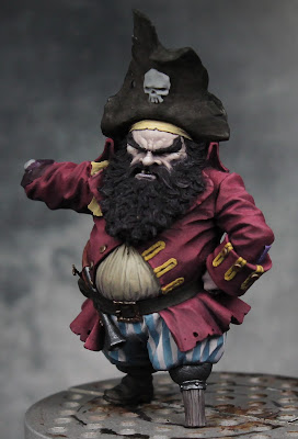
During the long weekend, I've had some hobby time.  One thing that bugged me about this figure was the sword.  It's got barnacles sculpted onto it (which, as a fantasy figure, is fine), but the rest of the surface is pretty normal.  Seems to me, if it's got barnacles growing on it, there would be a lot more corrosion going on.  I'd prefer either a smooth sword or one really crusty.  So, I decided to give it a little more texture.  I used a technique Sproket (David Soper) has used on Nurgle figures.  Baking soda is mixed with the base color and matte varnish to form a paste, then applied to the figure.  The base color is just there to speed up the painting, but the matte varnish is important to hold on the baking soda.  It gives a pretty secure bond when dry.

With the texture added to the sword, I went in with some stippling to further exaggerate the effect.  I left some exposed portions as still metal.

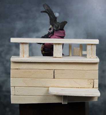
Since the figure is almost complete, I went back to work on the base.  The main structure was previously built using balsa wood.  To match the sword, I decided to add some texture to the side.  I used pro-create (grey stuff) to create some barnacles there as well.  Then I used the same baking soda + matte varnish technique to fill in the spaces around the barnacles.  I also added some rope and a portion of the rigging.  This was done using string.  I used superglue to coat the strings and lock them in the desired shape.  A bit of regular superglue can be helpful in attaching specific spots, but mostly I used thin super glue.  This quickly soaks into the string and is really useful for fixing large sections.  You've just got to be careful since it can get all over the place and you don't want to touch the strings as they'll be coated in glue.  Needless to say, I got a lot on my hands and there were numerous times I almost glued the myself to the base!


Monday, December 21, 2015

Additional Adepticon Class

For those of you coming to Adepticon, I wanted to let you know that we have added one more section of my Painting Realistic Faces class on Saturday, April 2nd.  The first two sessions sold out quickly, so if you weren't able to get a spot, now is your chance.  The class will be a combination of demo/lecture and hands on painting.

You can find the class by going to the Adepticon site and then clicking the registration button in the top left.

They've added extra sessions for several other classes as well.  I was poking around and saw another session of Kirill's Blending with Oils and Ben Komets' Loaded Brush.  So, if you missed out on classes the first time around, take a look and maybe you'll have a second chance.

Sunday, December 20, 2015

Barbarela Part 5

I've had a bit of painting time this past week, but it's been spent on small sections.  With the other hand attached, I finished off the sleeve and then painted the hand itself.  I used the same pale sickly skin mix I did for the face.  I then moved on to the beard and, with that finished, applied some glazes to the face.  Now, normally I use red, blue, and purple ink for this work.  Since I'm tweaking the skin tone for a less natural look, I changed the glazes as well.  The mixes were shifted towards the blue.  So, red became two parts red to one part purple.  Purple became 50/50 purple and blue.  The blue glaze remained blue.


Sunday, December 13, 2015

Barbarela Part 4

Well, I didn't do much painting this weekend but I did spend some time building the base for the dwarf pirate.  I used balsa wood to create a section of a pirate ship.  Thanks to some helpful internet searches, I think I creating something reasonably close to what a section of a real ship should look like.  I plan to add more details like ropes before I'm done.  I intentionally angled the deck as a ship would be constantly rocking from the waves and the angle makes a more interesting scene anyway.  Also, now that I have the ground where the dwarf will be standing, I was able to add his sword (so I could make sure it and his feet would all rest on the base).


Thursday, December 10, 2015

Barbarela Part 3

I've made some moderate progress on the dwarf.  I finished off the pants.  They still needed some shading on the blue sections and more highlighting all around.  For the blue I used Reaper's Heather Blue as the base, Midnight Blue to shade, and Ashen Blue and then a bit of Vampiric Shadow to highlight.

After that I worked on some details.  I took care of his peg leg, his pistol and belt buckle.  I also painted his left hand.  An errant brush stroke left some skin tone on his coat.  But, it gave me the chance to fix a few other issues in the coat that had been bothering me.  There was a line in the front (lower left) that didn't sit right with me, so I worked that out.  There were also some shadows on his left arm I felt were too dark, so I lightened them up a bit too.

Sunday, December 6, 2015

Barbarela Part 2

More progress on the dwarf pirate. I finished off the red on his coat.  I didn't want a bright red, so for the mid tone I used a 3 to 2 mix of Violet Red and Dark Elf Highlight (a grey).  The shadows were Burgundy Wine and the highlights were a mix of Fire Red, Dark Elf Highlight, and Vampiric Shadow (roughly 50/25/25).  I added a bit more Vampiric Shadow for the final highlights.

I've started to do some of the shading and blending on the pants, but they are still a work in progress.

Wednesday, December 2, 2015

Barbarela Part 1

I needed a break from the samurai, so I decided to start on this little figure from M Proyec.  He's a dwarf pirate at 1/35 scale so only around 45mm.  This is still at the very early stages.  The face hasn't gotten the glazes yet, the coat is shaded but not highlighted (and the bottom isn't even shaded), and the stripes on the pants are just sketched in.  But you get an idea of the colors and where this is headed.  It's a challenging piece.  The face is one of the trickier ones I've tried to paint.  He's got exaggerated features and small eyes that are almost completely hidden by the protruding brows.


Monday, November 23, 2015

Samurai Part 7

Just a quick update.  I went in and finished off the orange.  I'm not sure if I shared the mix before, but the orange is Burgundy Wine, Bronzed Shadow, Burnt Orange, and Linen White.  You can see the difference those further highlights make.  Here's a comparison between just the initial highlights and the figure with the final ones...

Aside from the orange I also painted his glove and the purple cord around his wrist.

In other news, Adepticon registration opened up tonight.  The classes filled up pretty quick, all the spots are gone for one of my faces classes and, last I checked, the second section only had two spots left.  I signed up to take a few classes too.  I'm taking Ben's loaded brush course, Kirill's blending with oils, and Angel's airbrushing masterclass.  There are a ton of great classes, I wish I could take them all!

Thursday, November 19, 2015

Samurai Part 6

After two weeks on the road, I'm finally back home and got the chance to do some work on my samurai project.  I stepped back from the sleeve design and decided to work on a different portion of the figure.  This is a figure that has a lot of overlapping parts, so he's being done in a number of stages.  Since I've completed the chest design and enough of the sleeve pattern, I decided I could add the flaps on his chest and his other arm.  I painted the armor flaps first and then moved on to the sleeve.  The orange is still a work in progress.  I've done the shadows but I'm just getting started on the highlights.

To give you an idea of where this is headed, here's a look at a cover from one of the Osprey books on the samurai.  I'm using the image on the far right as one of my major inspirations.  I'm shifting the cloth colors to orange and green but I'm keeping the purple for the armor.

Sunday, November 8, 2015

Samurai Part 5

Well, the last week wasn't great for painting.  I spent the previous weekend up in San Jose and then all last week I was traveling for work.  At least this weekend was free (well aside from taking care of household chores), so I was able to find a few hours to sit down and do some painting.  My focus is still the design on his arm... but I think it's finally starting to come together for me.  I did the main lines in the same orange as his shirt.  I then put in the white diamonds where the lines meet.  I think this provided a nice balance to the larger white circles.  Finally I started to do some design work within the circles.  There will be two designs in the end, alternating from circle to circle (so the blank ones will eventually have something in them).  I'm going to continue to the develop the design as I go.  I've got some ideas for what's next, but I'll keep experimenting to see what works for me.


Thursday, October 29, 2015

Samurai Part 4

I've touched up a few places on the samurai, taking the rest of the purple up to the brighter highlights.  Aside from that, my focus has been the pattern on the sleeve.  I finished the white circles and started working on the lines.  Here's where I hit a bit of a block.  I started on the back of the sleeve and made them a bit thicker.  I went thinner on the front and made some slight changes to the color mix.  I like the thinner lines better... but I'm still not sure I'm completely happy with it.  What do you all think?  What about trying a different color?  Something darker like the black on his chest design?  I considered purple, but it's already used for small edging details and I'm not sure it would be good to use here too.  Keep in mind I plan to add even more lines.  Plus there will be designs inside the circles.

And this was my inspiration for the design and why I initially thought to go with a yellow shade.  It's more of a metallic yellow here, but I'd rather avoid metallics for the cloth on the figure


Tuesday, October 27, 2015

2016 Adepticon Seminars

The seminar topics for the Adepticon 2016 have been chosen and I wanted to share with you the news that I'll be teaching two session on 'Painting Realistic Faces.'  The sessions will be Friday, April 1st, 10 pm - midnight and Saturday, April 2nd, 5 pm - 7 pm.  For anyone not familiar with Adepticon, it's held on March 31 to April 3rd at the Renaissance Schaumburg Convention Center (Chicago, IL).  It's a large gaming tournament and also includes the Crystal Brush painting competition which draws entries from all over the world.  There are a wide range of painting seminars taught by some amazing artists including classes from Ben Komets, Angel Giraldez, and Kirill Kanaev (plus many more).  It's definitely worth attending if you can make it.

You can see a preview of all the seminar topics and instructors here: http://www.adepticon.org/?page_id=9973
The link has been changing as they make updates, so if it doesn't work you can find the list in the main menu on the Adepticon homepage http://www.adepticon.org/.  Please note that registration opens up on November 23rd at 8 pm CST.  Many of the classes will fill up quickly, so if you know you're going register early!

As I said, I'll be teaching a class on painting faces.  If you're reading this blog I'm sure you're familiar with my work, but here are a few examples anyway...

The above examples are a bust (150-200mm) and two 90mm figures.  The class will be focusing on 54mm heads (though the technique is the same as what I used above) as that size will work better for the amount of time we have to work.  It will be a hands on course and I will supply heads for everyone to work on during the class.  Earlier this month we had a workshop day at SCAHMS where I did sort of a dry run for the Adepticon seminar.  Here's the example head I painted during the workshop.  I think I probably spent 45 minutes to an hour on it, so quite a bit faster than I normally work.  Obviously given more time I'd develop some of the finer details more, but it still worked well to get across the major concepts about highlight/shadow placement and color (or color variation).
I haven't decided which head set I'll be using for the seminar, but most likely it will be something like this.  I feel the 54mm heads (1/35 scale) are close enough to 28/32mm that they'll work for people who focus on gaming miniatures but large enough to where we can really get into the detail work.  I'm tempted to find some 75mm scale heads as then we can do even more detail work... but I worry that will alienate some of the gaming crowd.  I'm certainly open to thoughts and suggestions.  I want to make the class as helpful to everyone as I can.

Friday, October 23, 2015

Samurai Part 3

Well, this is not a major update... but since I'll be away from the painting table for the next few days I thought I'd share what I've done on the samurai in the past few days.  These are all cell phone pictures from my painting station (no light box setup or anything), but I will hopefully return to the more polished pictures next time.

Having finished the chest armor, I'm now turning to his arm.  These are just the first few steps, but I thought it would be interesting to show in a little more detail how I start on a different complex pattern.  The background color for this one will be green.  I wasn't especially happy with the shading/highlighting you saw in the last two posts, so I redid the sleeve.  Even though I will be painting over a lot of it with the pattern, I like to have a good base to work on.  On some patterns I will do the background color and the pattern color at the same time (or at least sketch in the pattern before shading/highlighting the background).  It really depends on the design and what I feel will be easier.  This one will involve a lot of thin lines, so it's easier for me to do the background first.

As for the pattern, I did a lot of searching through reference books and online.  I finally happened upon this pattern.  It's similar enough to the first one that I think they will look good together, but different enough to be a distinct design.  The white circles with the floral designs also gives me some more stuff to work with.
 

It's not that easy to really understand what's going on because of all the folds.  But I spent some time analyzing it here and in another picture of the same person/outfit.  As far as I can tell, this is how the pattern actually looks.

Now I'm finally ready to start transferring it to the figure.  What you see above will be rotated 45 degrees on the figure.  So I began with the main diagonal lines above and lightly painted on horizontal lines down the arm.  I got a rough idea of the spacing I wanted and created a guide to keep it consistent.  I then painted white dots (halfway between the horizontal lines) at where I thought the center of the circles should be.  Again, I used the same measuring guide to space them.  Because of the folds in the sleeve, I adjusted the spacing as I saw fit.  Then I started to paint in the main vertical lines (other half of the diagonals above).  These got a bit titled do to the movement and stretching of the cloth.  Finally I put in the diagonal lines between the dots (horizontal and vertical in the image above).  I still need to add in another two lines between each of the diagonals and fill out the rest of the circles, but this is a good point to stop and evaluate the design and spacing.  You can see I've already made some adjustments (notice the double white dots in places).  I will continue to turn the figure and view the pattern from different angles to check it and make adjustments where needed.  Once I'm happy with it, I'll fill in the remaining lines, draw the circles to scale, and start shading/highlighting all of the design.


Monday, October 19, 2015

Samurai part 2 and 1/2

Ha, so Shades informed me I was missing a few WIP images on this one.  I wasn't planning to do a step by step on the design... but I did take a few photos along the way just for my own reference.  I'll be doing this design in a few more places later on, so I wanted to have a reminder when I came back to it.  First, I marked off a series of equally spaced dots in a grid pattern. I took a scrap of paper and marked off the distance so the spacing would be consistent. These dots show me where the lines cross and where the red circles will go. I then painted thin diagonal lines connecting the dots. Following that, I went back over these lines to thicken them up, straighten them where need by, and get the sizing as consistent as possible. From there, I went back in with the white background color and painted lines perpendicular to the main ones in order to create the rectangles and squares.

Next I painted circles where the lines crossed. As before, I then went in with the background color and painted perpendicular lines to create the divisions. I then took a orange-ish red color and painted over the remaining dots to create the circles.

I then painted a thin circle followed by a thick circle around the red dots. By the way, there were plenty of mistakes at this stage (and previous ones). I was often using the background color to clean up lines that went off target or were too thick.

I then used thin white lines to divide up the red circles and the lines around them. I painted three lines for the small details in the larger circles (where the main lines cross) and added a white dot at the center of the squares. The key things are (1) to measure beforehand and place those guide dots so the spacing is consistent and (2) to go slow and just take it one part at a time.

Yesterday I did a little more work on the figure.  I increased the highlights on some of the thin purple details to push the contrast.  I also worked on the chest armor, finishing the sections over his shoulder and then on the top of his back.  There's a bit more design work there.  Unfortunately it will be mostly covered up by the rest of the helmet and his shoulder armor... but you will still be able to see it from one or two angles, so it had to be done.