I've been away from the painting table, but I thought I'd post something anyway. I figured hands would be a good subject to say a few words on. Like the face, hands can have a lot of character and many find them difficult to paint. They're a complex shape and one that can change a lot based on the pose. In the simplest variant, an open hand can be thought of as a flattened cube with cylinders as the fingers. But start to grip something or gesture and that flat back of the hand starts to become rounded and the inside of the hand turns into a mix of shapes. The fingers are somewhat cylindrical, but can also be more flattened and rectangular, with sharp corners as they are bent. That is why, as I approach that hands, I'm thinking about how shading looks on several basic shapes: boxes, cylinders, and spheres.
The next thing I'm thinking about is those fine level features. As the fingers bend you begin to get creases on the underside. The palm has all sorts of lines running across it. A trick here is to vary the intensity of those lines. If the hand is mostly open, you'll see some residual creases but they are subtle. You get that mostly flat line running horizontally under the base of the fingers (just above the middle of the palm) and that semicircle tracing out the base of the them. If the hand is open, DON'T make these dark! I'd stick with the mid tone or lighter for the lines and then use highlights to define them. Now, if the thumb is pulled in or the hand starts to cup, then yes, these lines can and should be quite dark. Use your own as a guide and vary the intensity as needed for the pose. When it comes to the back of the hands, I like to add subtle lines to show the separation of the knuckles and the tendons running down the back of the hand. Again, I'm not adding shadows so much as varying the amount of highlight. These are not major features so you don't want to paint them too strongly.
Finally, just like in the face, we need to add some color variation. For faces it can be broken down into thirds (yellow tint for the top third, red tint for the middle third, and blue tint for the bottom third). It's not quite so simple on the hands. But in general a bit of red around the knuckles is a good call. I might add some into the palm as well. Could you add some red to the tips? Sure. Take a look at reference images (or your own hand) and go from there. Some blue or purple can work well in the shadows too. If you feel up to it, you can also add a slightly different color on the tips to indicate the fingernails.
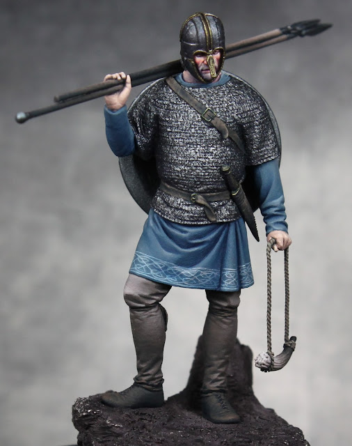
Okay, so how does all of that work in practice? Well here are some close up images from the Northumbrian figure. First is his hand holding the spear. On the left is a base coat of Rosy Shadow. In the middle I've done the shading (Rosy Shadow + Chestnut and Mahogany Brown) and the highlighting (Rosy Shadow into Fair Skin and then Fair Highlight). The image on the right shows the hand after I've done the glazing. I've got some red in the palm and the knuckles. I've taken some blues and purples to reinforce the shadows around the base of the hand and on the back. Because of the cold feel I've probably gone a bit stronger with the blues than normal, but I think it all still works.


Also notice the lines and creases. You can see the subtle lines where the hand meets the wrist. The line at the base of the thumb is a bit stronger as the thumb is moved in to grip the spear. On the back of the hand, the way it's flicked up forms a crease which I've shaded. Notice that the knuckles are developed more through highlighting and shading. There are also some very subtle vertical lines down from each knuckle visible in the middle and right images.
Below is a look at his other hand in a different pose. The approach is the same, but the shading and highlighting follow this alternative shape. The top/back of the hand is most flat and pointed upward so it is mostly highlight. Again I've hinted at the separation of the knuckles and the tendons with some subtle lines. There different here is between low level highlights and the brightest highlights. If I'd used actual shadow tone the result would look very off. The first section of the index is angled up so it's lit. The next section is down and is quite dark. The remaining figures are also angled downward so they are in shadow (of varying degrees). Again I've gone back in with glazes to add color. Pink it put around the knuckles and blue/purple is used to exaggerate the shadows on the lower part of the hand.

I'll close by saying the sculpt also plays a role in how easy or difficult it is to paint the hands. I find larger figures easier as the sculpt tends to have more detail in a 54mm (like this one) or 75mm than a 28mm figure will. And the skill of the sculptor is also at play. There are plenty of poorly sculpted hands where the shapes are overly simplified or the poses are uninteresting. You can fix somethings with the paint, but it can only do so much. As you look for display and competition figures, obviously pay attention to the faces, but also look to see how well the hands are sculpted. While not as critical as the face, they can contain a lot of character and expression.


 \
\