Thursday, October 29, 2015

Samurai Part 4

I've touched up a few places on the samurai, taking the rest of the purple up to the brighter highlights.  Aside from that, my focus has been the pattern on the sleeve.  I finished the white circles and started working on the lines.  Here's where I hit a bit of a block.  I started on the back of the sleeve and made them a bit thicker.  I went thinner on the front and made some slight changes to the color mix.  I like the thinner lines better... but I'm still not sure I'm completely happy with it.  What do you all think?  What about trying a different color?  Something darker like the black on his chest design?  I considered purple, but it's already used for small edging details and I'm not sure it would be good to use here too.  Keep in mind I plan to add even more lines.  Plus there will be designs inside the circles.

And this was my inspiration for the design and why I initially thought to go with a yellow shade.  It's more of a metallic yellow here, but I'd rather avoid metallics for the cloth on the figure


Tuesday, October 27, 2015

2016 Adepticon Seminars

The seminar topics for the Adepticon 2016 have been chosen and I wanted to share with you the news that I'll be teaching two session on 'Painting Realistic Faces.'  The sessions will be Friday, April 1st, 10 pm - midnight and Saturday, April 2nd, 5 pm - 7 pm.  For anyone not familiar with Adepticon, it's held on March 31 to April 3rd at the Renaissance Schaumburg Convention Center (Chicago, IL).  It's a large gaming tournament and also includes the Crystal Brush painting competition which draws entries from all over the world.  There are a wide range of painting seminars taught by some amazing artists including classes from Ben Komets, Angel Giraldez, and Kirill Kanaev (plus many more).  It's definitely worth attending if you can make it.

You can see a preview of all the seminar topics and instructors here: http://www.adepticon.org/?page_id=9973
The link has been changing as they make updates, so if it doesn't work you can find the list in the main menu on the Adepticon homepage http://www.adepticon.org/.  Please note that registration opens up on November 23rd at 8 pm CST.  Many of the classes will fill up quickly, so if you know you're going register early!

As I said, I'll be teaching a class on painting faces.  If you're reading this blog I'm sure you're familiar with my work, but here are a few examples anyway...

The above examples are a bust (150-200mm) and two 90mm figures.  The class will be focusing on 54mm heads (though the technique is the same as what I used above) as that size will work better for the amount of time we have to work.  It will be a hands on course and I will supply heads for everyone to work on during the class.  Earlier this month we had a workshop day at SCAHMS where I did sort of a dry run for the Adepticon seminar.  Here's the example head I painted during the workshop.  I think I probably spent 45 minutes to an hour on it, so quite a bit faster than I normally work.  Obviously given more time I'd develop some of the finer details more, but it still worked well to get across the major concepts about highlight/shadow placement and color (or color variation).
I haven't decided which head set I'll be using for the seminar, but most likely it will be something like this.  I feel the 54mm heads (1/35 scale) are close enough to 28/32mm that they'll work for people who focus on gaming miniatures but large enough to where we can really get into the detail work.  I'm tempted to find some 75mm scale heads as then we can do even more detail work... but I worry that will alienate some of the gaming crowd.  I'm certainly open to thoughts and suggestions.  I want to make the class as helpful to everyone as I can.

Friday, October 23, 2015

Samurai Part 3

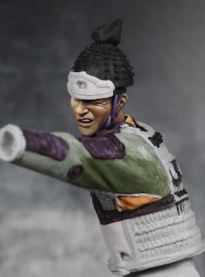
Well, this is not a major update... but since I'll be away from the painting table for the next few days I thought I'd share what I've done on the samurai in the past few days.  These are all cell phone pictures from my painting station (no light box setup or anything), but I will hopefully return to the more polished pictures next time.

Having finished the chest armor, I'm now turning to his arm.  These are just the first few steps, but I thought it would be interesting to show in a little more detail how I start on a different complex pattern.  The background color for this one will be green.  I wasn't especially happy with the shading/highlighting you saw in the last two posts, so I redid the sleeve.  Even though I will be painting over a lot of it with the pattern, I like to have a good base to work on.  On some patterns I will do the background color and the pattern color at the same time (or at least sketch in the pattern before shading/highlighting the background).  It really depends on the design and what I feel will be easier.  This one will involve a lot of thin lines, so it's easier for me to do the background first.

As for the pattern, I did a lot of searching through reference books and online.  I finally happened upon this pattern.  It's similar enough to the first one that I think they will look good together, but different enough to be a distinct design.  The white circles with the floral designs also gives me some more stuff to work with.
 

It's not that easy to really understand what's going on because of all the folds.  But I spent some time analyzing it here and in another picture of the same person/outfit.  As far as I can tell, this is how the pattern actually looks.

Now I'm finally ready to start transferring it to the figure.  What you see above will be rotated 45 degrees on the figure.  So I began with the main diagonal lines above and lightly painted on horizontal lines down the arm.  I got a rough idea of the spacing I wanted and created a guide to keep it consistent.  I then painted white dots (halfway between the horizontal lines) at where I thought the center of the circles should be.  Again, I used the same measuring guide to space them.  Because of the folds in the sleeve, I adjusted the spacing as I saw fit.  Then I started to paint in the main vertical lines (other half of the diagonals above).  These got a bit titled do to the movement and stretching of the cloth.  Finally I put in the diagonal lines between the dots (horizontal and vertical in the image above).  I still need to add in another two lines between each of the diagonals and fill out the rest of the circles, but this is a good point to stop and evaluate the design and spacing.  You can see I've already made some adjustments (notice the double white dots in places).  I will continue to turn the figure and view the pattern from different angles to check it and make adjustments where needed.  Once I'm happy with it, I'll fill in the remaining lines, draw the circles to scale, and start shading/highlighting all of the design.


Monday, October 19, 2015

Samurai part 2 and 1/2

Ha, so Shades informed me I was missing a few WIP images on this one.  I wasn't planning to do a step by step on the design... but I did take a few photos along the way just for my own reference.  I'll be doing this design in a few more places later on, so I wanted to have a reminder when I came back to it.  First, I marked off a series of equally spaced dots in a grid pattern. I took a scrap of paper and marked off the distance so the spacing would be consistent. These dots show me where the lines cross and where the red circles will go. I then painted thin diagonal lines connecting the dots. Following that, I went back over these lines to thicken them up, straighten them where need by, and get the sizing as consistent as possible. From there, I went back in with the white background color and painted lines perpendicular to the main ones in order to create the rectangles and squares.

Next I painted circles where the lines crossed. As before, I then went in with the background color and painted perpendicular lines to create the divisions. I then took a orange-ish red color and painted over the remaining dots to create the circles.

I then painted a thin circle followed by a thick circle around the red dots. By the way, there were plenty of mistakes at this stage (and previous ones). I was often using the background color to clean up lines that went off target or were too thick.

I then used thin white lines to divide up the red circles and the lines around them. I painted three lines for the small details in the larger circles (where the main lines cross) and added a white dot at the center of the squares. The key things are (1) to measure beforehand and place those guide dots so the spacing is consistent and (2) to go slow and just take it one part at a time.

Yesterday I did a little more work on the figure.  I increased the highlights on some of the thin purple details to push the contrast.  I also worked on the chest armor, finishing the sections over his shoulder and then on the top of his back.  There's a bit more design work there.  Unfortunately it will be mostly covered up by the rest of the helmet and his shoulder armor... but you will still be able to see it from one or two angles, so it had to be done.

Saturday, October 17, 2015

Samurai Part 2

The past few days have been good for painting.  I've started on the design work for his armor.  I did a good deal of searching online and through my reference books for ideas.  This isn't an exact match of any of them, but it's closely based on one of the ones I found.  I also started on the basic green for the sleeve.  I'm not entirely happy with the highlights and shadows there, so I'm going to tweak it some more.  But, when I'm done, I'll start laying a design over that as well.


Sunday, October 4, 2015

Samurai - first steps


This past week I began work on the samurai I teased a few posts ago.  I'm happy with the progress but this is just the first few steps in what promises to be a long long project.  I began with the face.  I switched up my usual skin mix, this time I used Volcano Brown, Bronzed Skin Shadow, Bronzed Skin, Bronzed Skin Highlight, and Linen White.  Over that I applied glazes of red, blue, and purple ink (from the Scale75 set).

My approach to painting the face was mostly what I've described in the past and on the tutorials section.  Of course as a 90mm figure there's more room to work on the details and expression, so I spent a lot more time on it.  A large part of the process is, after getting all the basic shadows and highlight in, closely evaluating the face from different angles and determining what works and what doesn't.  A line or shadow might look fine when viewed from the front, but doesn't work from the side.  I do this on all figures, but I spend a lot more time doing it on these larger faces.  I did a number of revisions like the area next to his right eye and the lines down from the nose, and the chin.  The face is going to be a focal point, so it's worth continuing to work on it until you're satisfied.  Once I was happy with what I had, I then did the glazing and final retouching of highlights.


There's a lot to this figure and the whole thing will be a multi-step process.  Once I get the bulk of his torso finished, I'll add his other arm.  It crosses in front of his chest, so it blocks access to the face and torso.  When I finish the sleeves and his back I'll be able to add the armor plates on his shoulders.  I'll need to paint those before I can add the rest of the helmet.  Then there's the lower body armor and stuff that will go on top of that (swords, quiver, and more straps/ropes).  Here's a look at the pieces still remaining, as you can see there are quite a few.