Showing posts with label female. Show all posts

Wednesday, June 7, 2023

Nancy (Neko Galaxy) Part 3

This project has been on hold for the past few months while I was getting ready for KublaCon. I wanted to make sure I finished the class figure before the show, so even though this piece was close I needed to focus on that other one as well as the bust for my faces class. Now that all of that is behind me, I can get back to the final touches on my Neko Galaxy project.

Although I didn't show it earlier, after my last post I continued on with the figure and painted her gun, socks, and shoes. I then began to work on the base. I pictured her in an urban setting. The scene in my mind is there was an attach by giant robots and she quickly grabbed what was handy to fight back. The outfit doesn't quite seem right for a dense jungle or some planned battle field. I mean, I at least assume she'd put on some more armor if she knew she was going to have to fight and had time to prepare. So on the street of a city made sense to me. I didn't want an overly large scene, so I picked a pretty tight base and ended up even cutting some of the sculpted ground that came with the kit so she would fit. I built a bent and damaged street sign, I figure damaged in the fight, to help convey the setting. She ended up having one foot that was slightly hanging over the base, so I put her standing on another bent and damaged road sign to help extend the scene a bit over the edge of the plinth. I just attached the standing sign and need to paint the post. I also plan to add some more streaks and weathering to the sign itself. Now that the sign is attached to the base, I'll sculpt a bit of curb around it to finish off that corner to the base. I also want to dress up the base a bit more with trash and debris that you might find on a city street normally or perhaps items that came from the battle. I've got some rough ideas but still need to refine them a bit before I start gluing anything else down.


Monday, February 13, 2023

Zoraida

Here's a look at this nearly finished project I'm doing as part of a miniature exchange. Back at the beginning of the year I started on Zoraida, a 75mm figure from Ares Mythologic's Draconia line. A bit of a older kit, though I guess that's relative, but one I've been wanting to paint since I first saw it. I stuck with a green theme for her clothing and equipment and then put in a pop of contrasting reddish orange to create a focus around her face.


She's got some cast shadows and NMM, as I'm continuing to practice both of those techniques. I'm pleased I've been able to get her nearly completed in just a month and half, since I feel like I normally work rather slowly. I plan to do a little more sculpting on the groundwork. With any luck, I'll have her finished in another week or so. 


Monday, November 21, 2022

Nancy (Neko Galaxy) Part 2

 October was a busy month, so not much painting happened. Things have started to calm down a bit, so I got back to painting over the past few days. I thought I'd share an update on Nancy from Neko Galaxy. She's different from my usual subjects, but that's made for a refreshing change. Plus she's just a fun figure, so how could I not enjoying working on her?

After painting the skin and body suit, I moved on to the hair. I tried to play up the shine effect with light reflecting off her hair. I then moved on to her armor. I'm taking more of a NMM approach on this one instead of my usual TMM. I feel like I've been slowly moving in the direction of NMM anyway. I still have some of Scale75's Heavy Metal in my mix, so the metal portions have a slight reaction to the light as you move the figure. But there's a lot of matte color mixed in, so the shadows and shine are pretty much frozen in place.

I started with a 1:1:2 mix of Strong Dark Blue (AK), Amethyst Blue (AK), and Heavy Metal. This formed my core shadow (steel mixed with a dark violet blue). Then I worked up to ~3:1:1 mix of Heavy Metal, French Uniform Base (AK), and Violet Light (RMS). This worked as my metal reacting to the ambient light. Then I shift to a 2:1 mix of Heavy Metal and Lemon Yellow (RMS), for my basic highlight. Then I introduced pure white to that for the top reflections. And, to some of the mid range mixes, I added carnage red so I could pick up some reflected light from the painted portions of her equipment.


Monday, October 3, 2022

Nancy from Neko Galaxy and Painting Skin

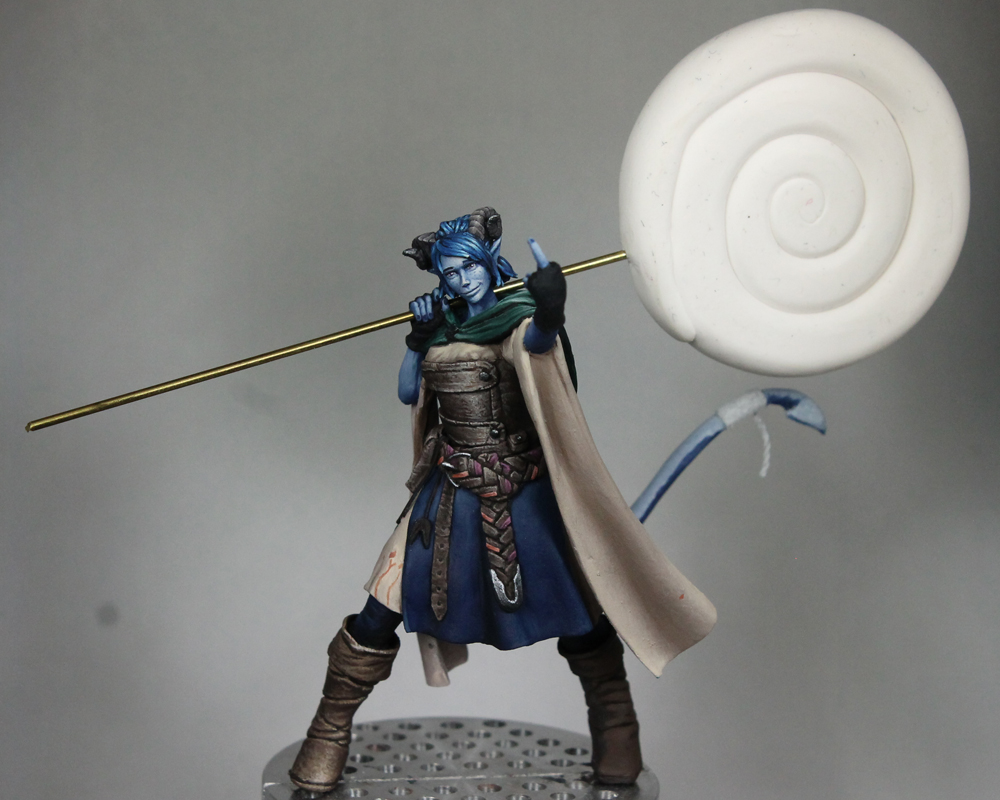
I just started on Nancy, a 75mm figure from Neko Galaxy. I've been focusing on improving my use of light and my skin work lately, so I thought I'd share some details of my approach for this figure.


I've been painting cast shadows on my last few projects and I find taking reference photos to be a huge help in making sure my cast shadow placement looks believable. A simple way to do that is to take the unpainted figure and place it under my painting lamp. I can then move the light around until I find an angle that I think works well with the figure. Be sure to keep in mind what your intended 'front' view for the piece will be when you picking your light placement!


For this piece I ended up taking two different series of reference photos, one with the unprimed figure and one after I'd primed her. Why? Well, on the unprimed figure you get more of a semi-gloss reflection off the bare resin. I wanted to create a similar shine when I painted the skin, so the unprimed pictures help me place those reflection points and understand their shapes. Now these reflections will change depending on what angle you're viewing the figure from, but if you stick with whatever view you think is the front, you should be fine. The second set is after priming. The figure now has a matte finish so it's a little easier to isolate the shaded vs lit regions. You can still get that information from the first image, but I think it reads clearer in the second. 


Jump forward to the painted figure and you can see the placement of shadows on the skin based on the reference photos as well as the reflection points. Of course you don't need to match them exactly, you can use your artistic license to make adjustments. For example, I've maybe pushed the shadows a little further towards the side on her face to keep it well lit. And I've added some small reflections to bring out the knees more. But overall I've stuck close to the reference photos and used those to help guide me as I painted.


As for colors, I recommend not getting too caught up in specific paints. You don't need this particular shade of red from this particular brand of paint to get similar results. Rather focus on the colors themselves (that blue was used here and yellow there, whether the colors are light or dark, saturated or desaturated, etc) and pick similar shades from whatever brand you prefer. Okay, end of disclaimer! ;D


I've got a mix of Reaper and AK Interactive paints. For a base, I used a 50/50 mix of Reaper's Rosy Shadow and Fair Skin. The darkest shadows were Reaper's Ruddy Leather mixed with Imperial Purple, Void Blue, and Rosy Shadow (something like 2 parts Ruddy Leather, 1 part Imperial Purple, 1 part Rosy Shadow, and a touch of Void Blue). Normally I'd substitute the blue for purple, but I wanted a more violet ambient light for this scene and hence the change. If I needed anything darker, I'd use the same mix but remove the Rosy Shadow and add in more Purple and Blue. From that shadow mix, I'd work in layers up to pure Rosy Shadow and then continue on until I reached the 50/50 Rosy Shadow and Fair Skin mix. For the highlights, I then began to add a 2:1 mix of Reaper's Lemon Yellow and Linen White into the 50/50 Fair Skin and Rosy Shadow mix. I wanted a yellow feel for my primary light source but if I worked up to pure Fair Skin first, that color would be about as light as the yellow is and thus it'd no longer work for the highlight. So I begin when I've still at 50/50 Rosy Shadow and Fair Skin.


For the reflection points on the skin, I started to add Pure White to the highlight mix but prior to reaching pure Lemon Yellow/Linen White. I liked the results better when I switched over to adding white while there was still some skin tone in the mix. 


Using the same approach as above, I also added red to the shadow tones and midtone (darker red into shadows, lighter red into midtone) and used that variation in areas like the nose, cheeks, and knees. However, I kept the same highlight mix rather than adding red there too. I then use intermediate mixes between the red variant and the main skin version to blend the transition regions. You'll see I still need to do some adjustments around the knees.


For the body suit, I switched over to mostly AK Interactive paints just because those are the shades I had handy. The base was AK's rock grey, a warm grey. For the shadows, I took a bit of Amethyst Blue and Strong Dark Blue (50/50) for a nice dark violet which will be used throughout the rest of the figure. I added some of that to AK's Neutral Grey. I began with that grey-violet mix for the darkest shadows and then gradually worked up to almost pure grey. I wanted the body suit to look white, not purple, so I tried to find a balance between adding in some of the ambient color without so much that it overpowers the primary color for the suit. Into the mix of mostly grey with a little violet, I then added Rock Grey. When I reached pure Rock Grey, I then started to add my Lemon Yellow and Linen White mix. Since the base color here was already pretty light, I switched up the highlight to a 1:2 mix of Lemon Yellow and Linen White (more white than yellow).


I'm debating if I also want to add pure white reflection points on the body suit to give it more of a shiny look. I'm going to hold off for now and wait to see how things look with the metal portions done. Speaking of which, the armor is based coated with that dark violet mix on areas that will eventually be metallic. Then there will be regions of painted metal, which I've based with a 50/50 mix of AK's Burnt Red and Medium Rust. I'm sticking close to the original concept art, but swapping the yellow in those for red just to make mine a bit different.


Wednesday, July 27, 2022

Completed Vesha and Elmer Ellsworth

Rounding up a couple recently finished pieces. First, the most recent, is Vesha from Bold Miniatures. I had a blast working on this bust, just a really fun piece to paint. I started her with the intention of practicing female skin. But this also became a piece for me to focus on painting light. I tried to push myself to be bolder in my use of color in the primary light, working with Lemon Yellow for the highlights rather than just a subtler off white. I also played with adding blue to the shadows, though I know I could have been bolder with the color there. Finally this was the first piece I made a serious stab at painting cast shadows on.


The second finished project I wanted to share was Col. Elmer Ellsworth, a 75mm ACW figure from FER miniatures. I painted this piece as a gift for my dad, a Civil War buff and the person who first introduced me to miniature painting. I tried to take the lessons I was learning from Vesha and apply them on Ellsworth as well. Again I worked with a warm yellow light, which was interesting to paint onto the dark blue uniform. And I worked in cast shadows which you can see on places like his forehead from the hat, his shoulder from his head, and on his leg and shoe from the sword.


Tuesday, February 1, 2022

Vesha Part 1

 Taking a break from orcs and monsters like Frank von Stein, I decided to shake things up with the half-elf Vesha, a bust from Bold Miniatures. My goal here, aside from painting a pretty model for a change, was to improve my use of light and shadow as well as work on my skin tones.

So far I've focused on the face and hair, then moved onto the weasel around her neck. The rest is just a sketch for light and shadow placement (though the fur around her neck has started to get a bit more refined). I just attached her left hand and it's only base coated so far. Her other hand has some very delicate figures which I'm sure I'll accidentally break while painting her, so I'm leaving that one off until the very end.

I've learned several things (or reinforced previously things learned) with this project:

 -  First, the importance of reference pictures. Especially if you want realistic light and shadows, take pictures of the figure under the desired lighting conditions.

 - Second, I need to be braver with my light color. While I understood the idea of using a specific colored light for the entire figure I would go with an off white rather than a more saturated color. I think I got too focused on making sure the highlights were bright and as a result they'd end up looking white regardless of the color I intended. On this figure I'm using much more yellow in the highlights with just a bit of white mixed in. I also need to switch to the highlight color sooner. If the skin tone paints get as light as the yellow before I start to add in the light color, it forces me to use more white to lighten it up. I think I was much more successful here getting those warm lights, especially on her skin. This is something I want to continue to work on with future projects and push for stronger effects with my lighting.

 - Third, working with colors in my shadows. The idea here is to bring in some of the ambient colors, in this case blue from the sky. You can see it most easily in the sketched on shadows in her shirt and the fur, though it's also in the coat, her hair, and her skin. I'm sure I could have done a lot more with the blue, especially in her skin. But this is still a step in the right direction and one I'll try to build off of on the next project.

 - Fourth, I'm starting to try to paint cast shadows with this piece. Yeah, there aren't any super dramatic cast shadows, but you should be able to see some under her nose, under the hair on her forehead and cheek, beneath the weasel's head, and on the back of the weasel. I'll continue on with them as I paint more of her. This is an area I've been tentative to try, but I'm glad I did on this project. While I'm certainly still learning, I can see the importance of making sure those shadows aren't too dark. They're still getting hit by ambient light, just not the main light source. This also means you should include the color of the ambient light in those shadows. And I want to balance the relative darkness of those shadows, so the shadow on the coat has the same step down in light relative to the base color on her coat as shadow on her face or on the fur beneath the weasel. The shadows don't need to be the darkest spots on the figure and making them too dark will look off. Save the darkest tones for areas that are blocked from the primary light and would also get minimal ambient light (like a combination of cast and occlusion shadows). And finally reference photos are extremely helpful in figuring out the placement of cast shadows.


Well, those are my main take aways from this figure so far. I plan to continue to keep those ideas about light and shadow in mind as I paint and refine the rest of the bust. But overall I'm very happy with how she's going.


Thursday, November 7, 2019

Jester [Critical Role] Part 2

A while back I posted about my process converted this 75mm figure into Jester from Critical Role. Now I'd like to share with you the painting I've done on her so far.

She's got light blue skin, but from the concept art it looked to be a bit warmer in the shadows. So I used a 50/50 mix of Reaper's Void Blue and Violet Light to start. Then I worked up to Snow Shadow and finally added in some Vampiric Skin (for an off white highlight). The hair is more of a standard blue, so I used Void Blue, shaded with Black, and then added Vampiric Shadow for the shine spots.

For the cloth I used a 50/50 mix of Dusky Skin and Basic Dirt (for that brown-grey off white) and just a touch of orange rust. Then Dusky Skin Highlight and Bronzed Skin (2:1) and finally Bronzed Highlight and Linen White (3:2).

The leather bits are Walnut Brown, Basic Dirt, and Khaki Highlight. While the boots are Walnut Brown, Basic Dirt, Driftwood Brown, and Vampiric Shadow to offset them a bit.


And, as a reminder, here's a look at the painted piece next to the bare conversion. I made plenty of mistakes during the conversion process since I'm still learning. Some I corrected then, others I'm attempting to correct as I paint (texturing sections like leather is a great way to hide issues with the underlying sculpt btw 😉)


Friday, October 25, 2019

Female Orc Part 3


Taking a break from all that blue, I decided to work on a few other parts of this figure. The non-metal covering on her looks to be of two types. Ones smoother and one has jagged edges (and stitches between sections), so I opted for two colors/materials. The jagged section is painted to look a bit more like raw hide while the smoother sections are treated as regular leather. I also started to work a bit on the hair, though there is still more to do. I wanted the hair to be mostly black, with a shock of white. Black hair can be tricky. Once you start to highlight it, the hair can quickly start to look like grey hair instead of black. I've dealt with this on a few pieces (the fallen angel and the dragoon) by painting a shine/reflection onto the hair. I feel like it successfully implies glossy black hair, so that's the approach I've used here as well.

There are a couple tricks with this approach. First, think about how the light would reflect off the hair. Don't simply place the shine at the topmost part (like you would with regular zenithal shading). Imagine the location of your light source and what angle the shine might appear if you viewed the figure from the front (the light reflection depends on both the position of the light source and the viewer). The other trick is making a quick transition from white (or near white) to black. You can see a full discussion of how I do that in this tutorial. In short, I begin with a sketch using 4 or so colors. I want to rough in the reflection which then allows me to see how it looks (is the placement right, how's the size, etc). I then do my traditional layering but this time working from light to dark. Start at the brightest spot and then blend outward to black. I like to maintain a gradient of color on my palette as it's easy to goof up the blend. When that happens, I can go back and grab an intermediate shade(s) and redo the transition. Eventually I get to a place I'm happy with, like below. At the moment I'm trying to decide if the reflection extends too far up and down. Perhaps it should be narrower? I might go back with some glazes and try to reduce the size a bit if I decide that is needed.


And here's another close up showing the latest work. You can click on the image to see the full resolution version in case you want an even closer look!


Monday, October 21, 2019

Female Orc Part 2 and Thoughts on Light

I've made some more progress with the skin and based a lot of her clothing. Here's a quick look at my latest progress.


One of the areas I wanted to work on with this figure was my use of ambient light. The general idea is how does light bouncing off the environment show up on the figure? In some sense, we all include this without thinking about it. Basic zenithal lighting (or the stop sign rule for the historical painters) has you transition from lightest at the top (or surfaces facing the light source) to darkest at the bottom (or surfaces away from the light source). If we actually excluded all of the ambient light and only had the single direct light source, every surface pointed away from the light source would be completely black. Instead we gradually transition to our darkest shade and even surfaces angled away from the primary light have some light hitting them (bounce light from the environment).

What I want to work on is using that light to convey more information about the environment and by that I mean color! Assume the surrounding environment is primarily one color (yellow for a desert, green for a field or forest, etc). That color light would be reflected back at the figure and tint the shaded regions. For this piece, I plan to have her over a primarily red base, so that will be my ambient color.

One important question to ask is how does ambient light differ from OSL? Strictly speaking, ambient light is a form of OSL in my opinion. Light is bouncing off the environment and hitting the figure. Thus the environment is my light source. However, unlike OSL from a lantern, the source is not concentrated but distributed over the entire ground. So it should be treated more like a directional light (up from below) rather than a point light source. We likely also want to approach the fall off and intensity a bit differently from typical OSL. With traditional OSL, we want that light to be dramatic! So you probably have a strong intensity near the source and then all that to quickly fall off with distance. For ambient light, the source is probably far more subtle (it's just reflected light, the ground is not generating its own light). And thus the fall off should be more gradual (or subtle) too. Now, let's say the primary light source is very strong and the environment is reflective/shiny. In that case, quite a bit of light might be reflected and thus you would have a stronger intensity to the ambient light. That is of course a special case, but I wanted to point it out as you should consider what you're painting and how it might affect the 'rules' rather than just blindly following them.

Below is a close up of the back of the orc (where you will see most of the ambient light at the moment). I'd say it's somewhat exaggerated, but I didn't want to go too subtle and not be able to tell it was there. Besides, the skin could be a bit reflective (satin finish) and thus pick up a bit more light. Still, I think the light is not too strong. You can compare that to the more intense OSL I used on the orc bust. Also a light from below, but meant to imply a source generating light rather than just a reflected light.


Tuesday, October 15, 2019

Female Orc Part 1

I decided to take another try at an old project. I got this 75mm scale female orc from GT Studio Creations. It's a bit of a different take on the subject and I liked the sculpt. It's also (hopefully) a straightforward project as there's just a few materials to work with (skin, leather, and metal). I actually first started painting her about a year and a half ago, but I got stuck. I had a basic vision for the piece but had trouble figure out exactly how I wanted to do the blue skin. I started on her and then changed my mind, painting over my previous work. I did this a couple times and the piece, especially the face, started to get over worked. It was turning into a mess so I abandoned the project.

Lately I've been looking for something fun to paint. There are a couple areas I want to work on, so I wanted a figure that would let me explore those topics. But I also wanted something that wasn't too complicated. I didn't want a project where I felt I'd likely get bogged down halfway through. After a bunch of indecisiveness, I decided to give this orc another shot. Since it was already in danger of having too much paint built up on it, I decided to just strip my old work and start fresh.

I'm sticking with my earlier vision, just not second guessing myself with the color mixes. For the skin I'm using a 3:2 mix of Void Blue and Violet Red. From there I transition to a 2:1 mix of Void Blue and Snow Shadow. From there I transition up to pure Snow Shadow and then some Vampiric Highlight for the brightest spots.

I want to play around with light on this figure. My main interest is playing with ambient or bounce lighting. This was something covered by Roman Lappat in a class I took with him at NOVA Open and I want to get in some practice. For this piece I plan to have a base that's mostly red. So that's why I'm adding Violet Red into the shadows. As I move down the figure and closer to the base, I plan to have the reflected red become more apparent. Of less importance, I wanted to work with a brighter main light as well. Recently I've fallen to using some rather dull off whites for my main highlights. I feel like it's creating the sensation of an overcast day. For this piece I switched to Vampiric Highlight (a nearly white highlight) just to switch things up a bit.


And here's a close up of the face. You can click on the image for the full resolution version. I like sharing these close ups from time to time as I think they're helpful in seeing what's actually going on with the brush strokes and blending.

Sunday, February 18, 2018

White Speaker Part 4

Here is the essentially finished White Speaker.  The only thing left is her spear, which will be stuck into the base.  It's possible I'll tweak one or two things on the figure as I take some time to look over it.  But at the moment I don't have any more work on her planned.

On the base, I started with just the basic dirt and rocks (plus the skulls and lantern).  After painting it, it was just a lot of grey and dull brown shades.  In part that's what I wanted.  The figure itself doesn't have much color, so I wanted the base to be simple so she would stand out.  But upon review, I decided the base was too uninteresting.  I weighed a few options and ended up deciding to add some red ivy along the ground.  I had some etched brass vines that I'd bought a while ago, so I clipped off a couple short sections.  I dulled the red a bit by adding in brown, so they didn't compete too much with the figure.  The use of red for the leaves, as opposed to green or some other color, was to tie in to the red already on the figure.