Thursday, November 7, 2019

Jester [Critical Role] Part 2

A while back I posted about my process converted this 75mm figure into Jester from Critical Role. Now I'd like to share with you the painting I've done on her so far.

She's got light blue skin, but from the concept art it looked to be a bit warmer in the shadows. So I used a 50/50 mix of Reaper's Void Blue and Violet Light to start. Then I worked up to Snow Shadow and finally added in some Vampiric Skin (for an off white highlight). The hair is more of a standard blue, so I used Void Blue, shaded with Black, and then added Vampiric Shadow for the shine spots.

For the cloth I used a 50/50 mix of Dusky Skin and Basic Dirt (for that brown-grey off white) and just a touch of orange rust. Then Dusky Skin Highlight and Bronzed Skin (2:1) and finally Bronzed Highlight and Linen White (3:2).

The leather bits are Walnut Brown, Basic Dirt, and Khaki Highlight. While the boots are Walnut Brown, Basic Dirt, Driftwood Brown, and Vampiric Shadow to offset them a bit.


And, as a reminder, here's a look at the painted piece next to the bare conversion. I made plenty of mistakes during the conversion process since I'm still learning. Some I corrected then, others I'm attempting to correct as I paint (texturing sections like leather is a great way to hide issues with the underlying sculpt btw 😉)


Friday, October 25, 2019

Female Orc Part 3


Taking a break from all that blue, I decided to work on a few other parts of this figure. The non-metal covering on her looks to be of two types. Ones smoother and one has jagged edges (and stitches between sections), so I opted for two colors/materials. The jagged section is painted to look a bit more like raw hide while the smoother sections are treated as regular leather. I also started to work a bit on the hair, though there is still more to do. I wanted the hair to be mostly black, with a shock of white. Black hair can be tricky. Once you start to highlight it, the hair can quickly start to look like grey hair instead of black. I've dealt with this on a few pieces (the fallen angel and the dragoon) by painting a shine/reflection onto the hair. I feel like it successfully implies glossy black hair, so that's the approach I've used here as well.

There are a couple tricks with this approach. First, think about how the light would reflect off the hair. Don't simply place the shine at the topmost part (like you would with regular zenithal shading). Imagine the location of your light source and what angle the shine might appear if you viewed the figure from the front (the light reflection depends on both the position of the light source and the viewer). The other trick is making a quick transition from white (or near white) to black. You can see a full discussion of how I do that in this tutorial. In short, I begin with a sketch using 4 or so colors. I want to rough in the reflection which then allows me to see how it looks (is the placement right, how's the size, etc). I then do my traditional layering but this time working from light to dark. Start at the brightest spot and then blend outward to black. I like to maintain a gradient of color on my palette as it's easy to goof up the blend. When that happens, I can go back and grab an intermediate shade(s) and redo the transition. Eventually I get to a place I'm happy with, like below. At the moment I'm trying to decide if the reflection extends too far up and down. Perhaps it should be narrower? I might go back with some glazes and try to reduce the size a bit if I decide that is needed.


And here's another close up showing the latest work. You can click on the image to see the full resolution version in case you want an even closer look!


Monday, October 21, 2019

Female Orc Part 2 and Thoughts on Light

I've made some more progress with the skin and based a lot of her clothing. Here's a quick look at my latest progress.


One of the areas I wanted to work on with this figure was my use of ambient light. The general idea is how does light bouncing off the environment show up on the figure? In some sense, we all include this without thinking about it. Basic zenithal lighting (or the stop sign rule for the historical painters) has you transition from lightest at the top (or surfaces facing the light source) to darkest at the bottom (or surfaces away from the light source). If we actually excluded all of the ambient light and only had the single direct light source, every surface pointed away from the light source would be completely black. Instead we gradually transition to our darkest shade and even surfaces angled away from the primary light have some light hitting them (bounce light from the environment).

What I want to work on is using that light to convey more information about the environment and by that I mean color! Assume the surrounding environment is primarily one color (yellow for a desert, green for a field or forest, etc). That color light would be reflected back at the figure and tint the shaded regions. For this piece, I plan to have her over a primarily red base, so that will be my ambient color.

One important question to ask is how does ambient light differ from OSL? Strictly speaking, ambient light is a form of OSL in my opinion. Light is bouncing off the environment and hitting the figure. Thus the environment is my light source. However, unlike OSL from a lantern, the source is not concentrated but distributed over the entire ground. So it should be treated more like a directional light (up from below) rather than a point light source. We likely also want to approach the fall off and intensity a bit differently from typical OSL. With traditional OSL, we want that light to be dramatic! So you probably have a strong intensity near the source and then all that to quickly fall off with distance. For ambient light, the source is probably far more subtle (it's just reflected light, the ground is not generating its own light). And thus the fall off should be more gradual (or subtle) too. Now, let's say the primary light source is very strong and the environment is reflective/shiny. In that case, quite a bit of light might be reflected and thus you would have a stronger intensity to the ambient light. That is of course a special case, but I wanted to point it out as you should consider what you're painting and how it might affect the 'rules' rather than just blindly following them.

Below is a close up of the back of the orc (where you will see most of the ambient light at the moment). I'd say it's somewhat exaggerated, but I didn't want to go too subtle and not be able to tell it was there. Besides, the skin could be a bit reflective (satin finish) and thus pick up a bit more light. Still, I think the light is not too strong. You can compare that to the more intense OSL I used on the orc bust. Also a light from below, but meant to imply a source generating light rather than just a reflected light.


Tuesday, October 15, 2019

Female Orc Part 1

I decided to take another try at an old project. I got this 75mm scale female orc from GT Studio Creations. It's a bit of a different take on the subject and I liked the sculpt. It's also (hopefully) a straightforward project as there's just a few materials to work with (skin, leather, and metal). I actually first started painting her about a year and a half ago, but I got stuck. I had a basic vision for the piece but had trouble figure out exactly how I wanted to do the blue skin. I started on her and then changed my mind, painting over my previous work. I did this a couple times and the piece, especially the face, started to get over worked. It was turning into a mess so I abandoned the project.

Lately I've been looking for something fun to paint. There are a couple areas I want to work on, so I wanted a figure that would let me explore those topics. But I also wanted something that wasn't too complicated. I didn't want a project where I felt I'd likely get bogged down halfway through. After a bunch of indecisiveness, I decided to give this orc another shot. Since it was already in danger of having too much paint built up on it, I decided to just strip my old work and start fresh.

I'm sticking with my earlier vision, just not second guessing myself with the color mixes. For the skin I'm using a 3:2 mix of Void Blue and Violet Red. From there I transition to a 2:1 mix of Void Blue and Snow Shadow. From there I transition up to pure Snow Shadow and then some Vampiric Highlight for the brightest spots.

I want to play around with light on this figure. My main interest is playing with ambient or bounce lighting. This was something covered by Roman Lappat in a class I took with him at NOVA Open and I want to get in some practice. For this piece I plan to have a base that's mostly red. So that's why I'm adding Violet Red into the shadows. As I move down the figure and closer to the base, I plan to have the reflected red become more apparent. Of less importance, I wanted to work with a brighter main light as well. Recently I've fallen to using some rather dull off whites for my main highlights. I feel like it's creating the sensation of an overcast day. For this piece I switched to Vampiric Highlight (a nearly white highlight) just to switch things up a bit.


And here's a close up of the face. You can click on the image for the full resolution version. I like sharing these close ups from time to time as I think they're helpful in seeing what's actually going on with the brush strokes and blending.

Tuesday, October 1, 2019

Jester [Critical Role] Part 1

Since I was happy with my last conversion based on Critical Role, I decided to start on another. One of my favorite characters from their second campaign is Jester, a tiefling trickster cleric. When I want to create a specific character figure that isn't on the market, I like to keep my eyes out for figures that are close enough that they wouldn't be too hard to convert. In this case, there really wasn't anything remotely close... so I knew this would be a significant conversion.

Instead of buying a piece specifically for this project, I looked through my collection of kits to see if I had anything I didn't mind sacrificing to this project. I decided on the Morlock Girl from Luxumbra. I'd gotten it as part of their kickstarter but didn't like the figure as much as I did the concept art, so it was not one I was likely to ever paint. Which meant, if I screwed up, no big loss. This time I decided to do a bit more planning before starting on the sculpt. I made some sketches and decided to repose the arms. I wasn't a fan of the face on the Morlock girl, so I swapped the head with a dark elf figure from RN Estudio.

After re-positioning the arms and swapping the head, I took a picture of the figure with a white background and printed it out. On top of this, I could then sketch how I wanted the clothing to look and just generally get a better picture of what I wanted to do. This was prep I hadn't done with the previous one and probably should have.

From there, I started to sculpt. I'm working with ProCreate, a two part compound like Green Stuff. So work is done in a lot of layers. Sculpt a bit, let it harden, then sculpt on the next bit. I started with the leather armor on her torso and then moved onto the skirt. Cloth is tough and I still could learn a lot about how to do it right. In this case, I first setup a base layer that won't be seen, but gives me some structure to add the following layers on top of. For the actual cloth, I place the putty between two pieces of parchment paper (wet each side a little to prevent it sticking too much) and then roll it out flat. Once it's thin enough for my project, I peel the top layer of paper off. Smooth out any wrinkles that may have been put in and then cut it roughly to size. Now I can peel it off the bottom layer of paper and carefully drape it onto the figure. I gently use some sculpting tools to help position it and create waves or folds.

I also work with wire to help create armatures for anything sticking out of the figure. In this case, I added a wire for the tail (as you can see above) and then two wires for the tiefling's horns. I found this to be especially helpful as I can play with the wires until they are symmetrical. That should help my final sculpt also look symmetric.

From there it's more layers: finishing the boots, adding the belts, pouches, etc. You can see I'm also using some metal for details. For the belt buckle, I've got a bent wire. I also have some aluminum sheet that I can cut and have used for one of her belts. For the patterned belt, I began like I did with the cloth (roll it out and cut it to the right dimensions, then drape it around the figure). Though the belt is wrapped around itself, I didn't actually wrap the putty. I used a couple pieces and faked the end result. For the pattern on the belt, I simply used a sculpting tool to press into the putty once it was in place. I probably could have measured to make the pattern more uniform, but in this case I just did it by eye and accepted the end result as good enough.

You'll notice a few more wires in the above image. Jester has these long flowing sleeves that I know will be a pain in the butt to sculpt. So I wanted something I could use to lay the putty on and provide some structure. I've also anchored those wires to my holder. Once the putty is hardened, I will cut that part off.
The sleeves were indeed a pain to make. These were done in several steps. First I rolled out and cut the front, gently laying it on the wire and creating my desired folds. Once that had hardened, I added another layer behind it to hide the wires and give it a bit more rigidity. I used some sanding and patching with more putty to smooth out imperfections that happened as I was sculpting it.

You'll notice I've also sculpted the giant lollipop she'll be carrying. For this I switched to Fimo. As this is a separate piece, I could sculpt it and then bake it. For the main figure, the initial piece is resin so any baking could melt it. I'm not entirely happy with the result, so I plan to resculpt it soon to see if I can't do something a little better.

Finally I made her cloak. Again, rolling it out and cutting it into shape (a crescent). I draped it on and sculpted the folds around the front. I then let that harden before returning to add the hood on top. I also did a few final details like revising some of the hair to better match the character.


Each time I do this, I feel like I learn a lot along the way. If you want to try a similar conversion, my best advice is just to start trying it. Watch sculpting videos (plenty on youtube for green stuff) to get a sense of how to use the various tools to manipulate the putty. Remember it's not a race. If you get a section you're happy with, stop and let it harden! It's very frustrating to get a part looking good and then accidentally put your finger into it while working on another area of the figure.

On this piece, I feel like I'm getting a better handle on cloth, though I know I still have a long way to go. With practice I'm getting more comfortable though. In hindsight, I wish I'd made a number of the layers thinner. The armor and cloth bulked her out a bit more than I intended. I'd also like to gather more references for folds and other details. And, some things you can fix while painting (like creating the illusion of texture).

I'll post more on the painting soon, but here's a quick preview to see how the (partially) painted piece looks next to the bare conversion.


Monday, August 26, 2019

Onitsukaji Part 2

I've done a bit more work on the new orc. I moved on to the forearms, painting the bit of skin poking through the wrappings and one of his hands. I also painted the wrappings. I'm still making some adjustments there, but it's nice to start painting something other than skin! I've blocked in some colors on the lower body... but I'm still debating what I want to do there, so I may switch that up a bit.


I've posted about photography before, but it's been a while so I thought I'd share a peak at my photo setup. It's rather simple and I find that to be helpful. I can quickly turn my painting station into my photography area and then back again to painting with a minimum of hassle. My lights are adjusted to be hitting the model from the front and on either side. I want to minimize any shadows cast by the lights so I can more clearly show what's been painted


Aside from the painting, I've been rethinking the base and composition. I went into this piece with a number of ideas for the scene and the intention to more fully flush them out as I went. As I continued to brainstorm and play around with different ideas, I kept feeling like I wasn't happy with the composition I'd put together. Plus I was developing a favorite angle from which to view the orc and would prefer to have that facing the front of the base. I decided to swap sides and move the goblin to the orc's left. I like this much more. It feels better balanced to me and creates a nice tightly packed scene I can work with. I think I've settled on a scene for them too... though I need to make sure I can actually create the details I need, so we'll see how it goes!


Monday, August 19, 2019

Onitsukaji Part 1

I gave you a preview of this project in my previous post. I needed a fun piece to help me recharge and so far this has fit the bill well. I'm planning to make this part of a 2 figure scene, but I had to start somewhere so I chose to begin with the larger of the two.

I spent a bit of time thinking about what sort of color scheme I wanted for the piece. Part of the fun of fantasy is the freedom to work with a variety of colors. While orcs are most commonly depicted as green, there's plenty of fantasy work (for example Paul Bonner's art) where they come in a variety of colors. I've already done some variations on green with orcs and just did a blue one for the Hera Models bust. So I opted for something of a red-violet shade for the big orc. My intention is to go with a triadic color scheme, so that makes blue-green and orange-yellow as my other main colors. I can certainly work both of those into details on this figure's body. For the goblin, I might switch back to green for the skin, but use more of a blue-green shade like I did with the Orc Brave from Ouroboros.

This guy has a lot of exposed skin. Since it's such a large area, I prefer to break it into smaller sections and work on one of those at a time. This helps me keep track of things like where I put my last layer, which regions I've started to reduce the area of application to form the top highlights, etc. If you're part of the Kimera Kolors Painting Club on Facebook, you can find a bit of a longer discussion on why I choose to paint this way and some tips on how I make it work there. Just search the 'Tutorial' topic. Anyway, below you can see how he came together one section at a time.
I still have the back to finish, along with the forearms and hands. But I'd at least like to base coat those straps around his arms before I work on those sections of skin. The mix I'm using for the skin is a variation I've used on red for a couple of figures and one I happen to like. For the base coat, I used a 60/40 mix of Violet Red and Dark Elf Skin. Burgundy Wine for the shadows and then a mix of 50/25/25 Fire Red, Dark Elf Highlight, and Vampiric Shadow for the highlights. I mix some Linen White into that for the top highlights. I think the combination of the red with a cool grey creates a nice desaturated red-violet.


Monday, August 5, 2019

Starting a new project

While this post will (hopefully) be a preview of an upcoming project, it's also going to discuss my process on what I look for and think about when I begin a new piece.

Lately I've felt like I'm in a bit of a rut with my painting. I've got a piece I'm painting, but seems like each section I do I find I'm not happy with and wind up redoing it. So it feels like I'm not getting much done. The other day I decided it might be best to put that piece on hold for a bit and start something new to hopefully recharge my mojo.

I've been searching through my collection of kits to see what sparks my interest. There's a lot of neat figures but these days I look for a couple things in any new project...

1) What can I do that hasn't been done before? With the forums, Facebook groups, instagram, etc you've likely already seen several versions of any commercial kit. And often you'll find some really amazing versions painted by some of the pros. So how do I make my work stand out from the rest? How do I make it memorable? Well, I try to find a way to do something new with the figure. It could be as simple as a new color, but I typically aim for a bit more. Perhaps I can interpret the figure in a different way. I think of the 
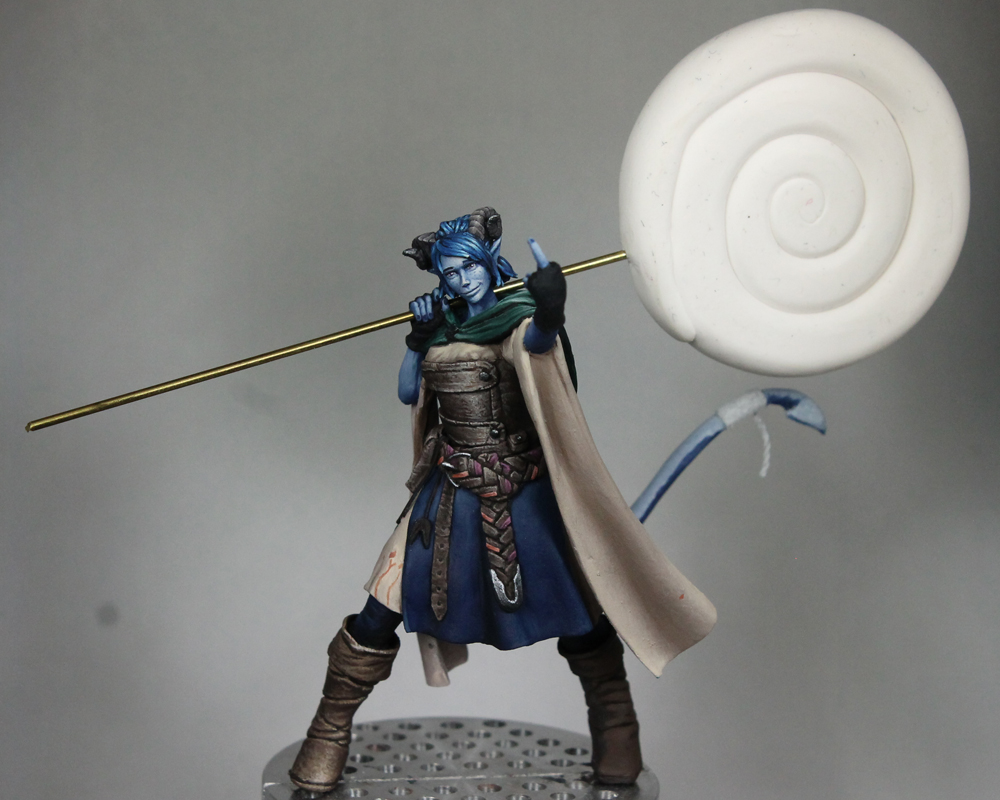
fallen angel piece I did a while back. The figure was intended as a 'good' angel. But with a different color scheme and setting, it became more of a demonic entity.

Another way to do something different is to pair two or more figures together. A lot of people may have painted figure A, but has anyone ever paired it with figure B? That helps to create a unique scene when you pair two figures that weren't initially designed to go together. Of course the figures have to work together for the piece to be successful.

Tied into all of that is the story behind the piece. These days I try to come up with some story, some setting for the figure beyond just 'hey, here's a neat figure standing in a field.' I've done my fair share of figures on ground, but if you can make the scene something more that too helps it stand out. The stronger the story, the more memorable the piece will be.

2) What can I learn from this piece? No matter how good you are, there's always room for improvement. Since I first got into display and competition painting, I've had a mental list of topics I wanted to work on. On that list has been painting textures (leather, etc), TMM, weathering, base work, greater contrast, color variation, etc. I usually pick one or two topics and attempt to improve those with whatever project I have planned. At the moment, high on my list is working with light. That includes aiming for more interesting and complex lighting conditions (like I did with my recent Hera Models orc bust) and introducing ambient light and how light reflecting off one object can influence the color of another. Other topics on my current list are color schemes, composition, compelling base work, more multi-figure scenes, and probably more if I continue to think about it.

3) Does it spark joy? Okay, I'm not really a follower of Marie Kondo, but I do what a project to be fun. So, simply put, am I excited to paint it? While the first two topics are things I hope to be able to work on with any project, this last one is a must!

For the near future I'm not able to travel to any shows/competitions. But, if there was a show I planned to attend in the next 6 months or so, I'll also weigh whether or not that new project could be entered there.

And there you have my general thought process as I look for new projects. I will say, as of late, I feel like I've been putting more pressure on myself with my new pieces. I've always tried to make each piece better than the last because that's how I continue to improve. But lately I feel like I have a standard that I have to live up to. So when a project isn't as good as I want it to be, it can be very discouraging. While I do want to continue to grow and improve, painting is also an outlet and a way for me to relax and enjoy myself. At the moment I feel like those two aren't quite in balance. I'm not exactly sure how to fix that, but I'm hoping a new project will help.

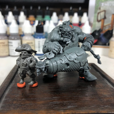
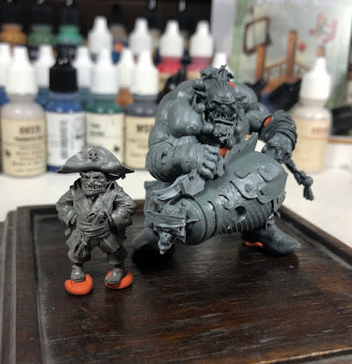
So... what's next on my to paint list? I've been digging through my collection this past weekend and I think I've finally settled on Onitsukaji from Big Child Creatives. It's a fantastic sculpt with a lot of character. And I also really enjoyed painting Redghar from their first kickstarter, so I'm hoping this will feel similar. To address some of my questions for any new project... what can I do with Onitsukaji that hasn't been done before? One thing that came to mind is to put him in a multi-figure scene (which also hits one of the topics on my list from #2). I've been sitting on Bocanegra since the first kickstarter, knowing that I wanted to use him in some scene. I think he could work with Onitsukaji and I really like the size juxtaposition between these two.

I did a mock up of how the two might look together and took a few pictures:


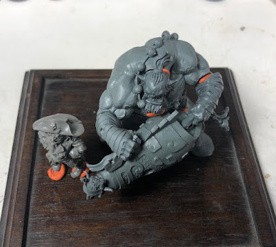
At this point I'm starting to brainstorm a story for them. Why are they together? What are they doing? Bocanegra clearly has a pirate look, so the story should have something to do with that. Onitsukaji to be about to shoot someone or launch that goblin at something. That certainly gives me stuff to work with. And it doesn't need to be the most intricate and detailed story. But are they standing on the edge of a ship about to shoot at a ship they're planning to raid? Maybe they've come off the ship and are at the gates of a town, threatening to blow their way in. I'm still coming up with ideas. But, when I finally settle on the one I like the best, that will help me figure out how the scene should look, what elements I should include in the base to help convey that story. I also need to come up with a color scheme for the pair and what sort of lighting conditions I want to use in the scene. Knowing the story and setting might also help me figure out those details.

I should say that I don't always do so much planning. Sometimes it's good to just grab a figure, start painting, and figure out everything else later. But, more often than not, this is how I will approach any new project. Hopefully it provides some helpful insights!

Thursday, July 11, 2019

Hera Models Orc Bust

Wow, it's been quite a while since I've updated this blog! Over the next few posts I'll try to catch up on the projects I've completed. The first one I want to share is my most recent, the academic orc bust from Hera Models. I think their academic line is a neat idea. It provides figures that are great for focusing on a technique or skills such as shading, blending, skin, etc. They also provide a nice base figure that could be converted into something unique by adding clothing and equipment. While I didn't make any modifications to the orc, it's something I'd like to try on some of their other busts at some point.

I've seen this bust painted up quite a few times. It's a popular figure and, having now worked on it, I can easily see why. It's a dynamic piece with a lot of great shapes to work with. Unfortunately, since he's already been painted by so many artists, I struggled a bit to find a way to do something unique with him. In the end, I decided to focus on lighting. Most of the versions I've seen use traditional zenithal lighting, so I decided to move my main light source off to one side. It's a bit like 3/4 lighting, but perhaps a bit farther to the side that even that. I also liked how this lighting throws half of the face into shadow and, in my opinion, makes him look even more menacing. I think I also angled him a bit farther forward that most of the other versions I've seen. He feels a bit more feral this way. And, it's a bust, so there's no clear 'correct' angle like you'd have with a figure on foot.

With the main light source off to one side, I added a secondary light source from the other side and below. This helps provide some definition to the shapes on the shaded side of the face and, in my opinion, just looks cool. =P Working with multiple light sources is something I still find very challenging, so the academic bust provided a great opportunity to practice. I painted the entire bust with the primary light source before added the secondary light. I did a rough sketch of the secondary light to check my placement, did it look like the right surfaces were being hit? I went through several iterations of that. Refining the sketch with some rough blending, allowing me to start to vary the intensity/brightness. Stop to see how it's reading. Some parts would look good, other parts wouldn't feel quite right. So back for another round. As I became happy with regions, then I'd go in and refine the transitions to smooth them out. It took some time, but in the end I was happy with the final result.


Monday, January 21, 2019

Mollymauk Part 5

This has been a project I've had going on in the background for quite a while.  With all the design work, it's an easy one to get burnt out on.  So best to work a bit here and there, keep it moving forward while taking breaks with other projects.  But, as we're getting close to Adepticon, I'm redoubling my efforts to finish off the pieces I want to take with me.

The tiefling is very close to being completed.  The part that was giving me headaches was the crescent moon pattern on the inside of his coach.  I took a couple different attempts at it before finding an approach I liked.  I started just free-handing them (without a guide).  You'd think I'd know by now that that never turns out well.  I then moved on to placing equally spaced dots (see the guide dots from many of my other posts on freehand) and drawing circles around each one (again using a guide to get the sizing down).  From there, I could fill in the circle and then use the background blue to carve out a bit to make the crescent shape.  I took two stabs at this before I finally got a size and spacing I liked.

I've done the inside of the sleeves and hood, but still have to do the inside of the main body of the coat (which will be visible around the legs).  Going to be tricky getting in there, but I should be able to fade them into shadow as they go up and make my life a bit easier.

Other recent work has been on detailing the horns.  Still working on that, but happy with how it's looking.  Hopefully in the next week or two I'll finish up the painting on him.  There's still the base to do, but I don't plan on doing anything too complicated with that.