Monday, November 21, 2022

Nancy (Neko Galaxy) Part 2

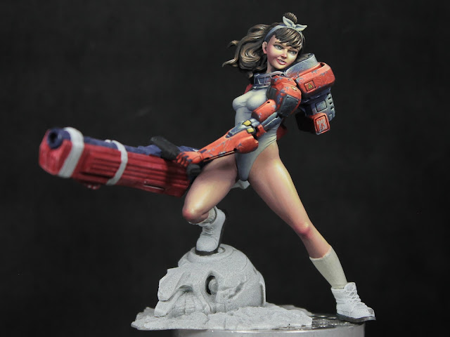
 October was a busy month, so not much painting happened. Things have started to calm down a bit, so I got back to painting over the past few days. I thought I'd share an update on Nancy from Neko Galaxy. She's different from my usual subjects, but that's made for a refreshing change. Plus she's just a fun figure, so how could I not enjoying working on her?

After painting the skin and body suit, I moved on to the hair. I tried to play up the shine effect with light reflecting off her hair. I then moved on to her armor. I'm taking more of a NMM approach on this one instead of my usual TMM. I feel like I've been slowly moving in the direction of NMM anyway. I still have some of Scale75's Heavy Metal in my mix, so the metal portions have a slight reaction to the light as you move the figure. But there's a lot of matte color mixed in, so the shadows and shine are pretty much frozen in place.

I started with a 1:1:2 mix of Strong Dark Blue (AK), Amethyst Blue (AK), and Heavy Metal. This formed my core shadow (steel mixed with a dark violet blue). Then I worked up to ~3:1:1 mix of Heavy Metal, French Uniform Base (AK), and Violet Light (RMS). This worked as my metal reacting to the ambient light. Then I shift to a 2:1 mix of Heavy Metal and Lemon Yellow (RMS), for my basic highlight. Then I introduced pure white to that for the top reflections. And, to some of the mid range mixes, I added carnage red so I could pick up some reflected light from the painted portions of her equipment.


Monday, October 3, 2022

Nancy from Neko Galaxy and Painting Skin

I just started on Nancy, a 75mm figure from Neko Galaxy. I've been focusing on improving my use of light and my skin work lately, so I thought I'd share some details of my approach for this figure.


I've been painting cast shadows on my last few projects and I find taking reference photos to be a huge help in making sure my cast shadow placement looks believable. A simple way to do that is to take the unpainted figure and place it under my painting lamp. I can then move the light around until I find an angle that I think works well with the figure. Be sure to keep in mind what your intended 'front' view for the piece will be when you picking your light placement!


For this piece I ended up taking two different series of reference photos, one with the unprimed figure and one after I'd primed her. Why? Well, on the unprimed figure you get more of a semi-gloss reflection off the bare resin. I wanted to create a similar shine when I painted the skin, so the unprimed pictures help me place those reflection points and understand their shapes. Now these reflections will change depending on what angle you're viewing the figure from, but if you stick with whatever view you think is the front, you should be fine. The second set is after priming. The figure now has a matte finish so it's a little easier to isolate the shaded vs lit regions. You can still get that information from the first image, but I think it reads clearer in the second. 


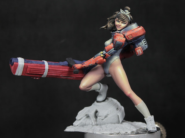
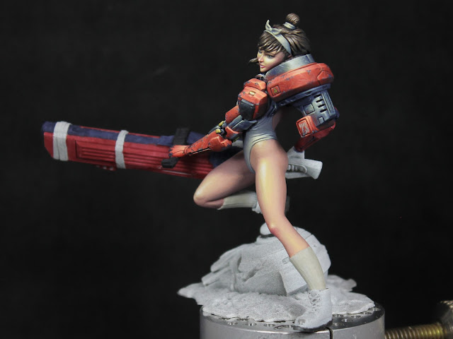
Jump forward to the painted figure and you can see the placement of shadows on the skin based on the reference photos as well as the reflection points. Of course you don't need to match them exactly, you can use your artistic license to make adjustments. For example, I've maybe pushed the shadows a little further towards the side on her face to keep it well lit. And I've added some small reflections to bring out the knees more. But overall I've stuck close to the reference photos and used those to help guide me as I painted.


As for colors, I recommend not getting too caught up in specific paints. You don't need this particular shade of red from this particular brand of paint to get similar results. Rather focus on the colors themselves (that blue was used here and yellow there, whether the colors are light or dark, saturated or desaturated, etc) and pick similar shades from whatever brand you prefer. Okay, end of disclaimer! ;D


I've got a mix of Reaper and AK Interactive paints. For a base, I used a 50/50 mix of Reaper's Rosy Shadow and Fair Skin. The darkest shadows were Reaper's Ruddy Leather mixed with Imperial Purple, Void Blue, and Rosy Shadow (something like 2 parts Ruddy Leather, 1 part Imperial Purple, 1 part Rosy Shadow, and a touch of Void Blue). Normally I'd substitute the blue for purple, but I wanted a more violet ambient light for this scene and hence the change. If I needed anything darker, I'd use the same mix but remove the Rosy Shadow and add in more Purple and Blue. From that shadow mix, I'd work in layers up to pure Rosy Shadow and then continue on until I reached the 50/50 Rosy Shadow and Fair Skin mix. For the highlights, I then began to add a 2:1 mix of Reaper's Lemon Yellow and Linen White into the 50/50 Fair Skin and Rosy Shadow mix. I wanted a yellow feel for my primary light source but if I worked up to pure Fair Skin first, that color would be about as light as the yellow is and thus it'd no longer work for the highlight. So I begin when I've still at 50/50 Rosy Shadow and Fair Skin.


For the reflection points on the skin, I started to add Pure White to the highlight mix but prior to reaching pure Lemon Yellow/Linen White. I liked the results better when I switched over to adding white while there was still some skin tone in the mix. 


Using the same approach as above, I also added red to the shadow tones and midtone (darker red into shadows, lighter red into midtone) and used that variation in areas like the nose, cheeks, and knees. However, I kept the same highlight mix rather than adding red there too. I then use intermediate mixes between the red variant and the main skin version to blend the transition regions. You'll see I still need to do some adjustments around the knees.


For the body suit, I switched over to mostly AK Interactive paints just because those are the shades I had handy. The base was AK's rock grey, a warm grey. For the shadows, I took a bit of Amethyst Blue and Strong Dark Blue (50/50) for a nice dark violet which will be used throughout the rest of the figure. I added some of that to AK's Neutral Grey. I began with that grey-violet mix for the darkest shadows and then gradually worked up to almost pure grey. I wanted the body suit to look white, not purple, so I tried to find a balance between adding in some of the ambient color without so much that it overpowers the primary color for the suit. Into the mix of mostly grey with a little violet, I then added Rock Grey. When I reached pure Rock Grey, I then started to add my Lemon Yellow and Linen White mix. Since the base color here was already pretty light, I switched up the highlight to a 1:2 mix of Lemon Yellow and Linen White (more white than yellow).


I'm debating if I also want to add pure white reflection points on the body suit to give it more of a shiny look. I'm going to hold off for now and wait to see how things look with the metal portions done. Speaking of which, the armor is based coated with that dark violet mix on areas that will eventually be metallic. Then there will be regions of painted metal, which I've based with a 50/50 mix of AK's Burnt Red and Medium Rust. I'm sticking close to the original concept art, but swapping the yellow in those for red just to make mine a bit different.

Wednesday, July 27, 2022

Completed Vesha and Elmer Ellsworth

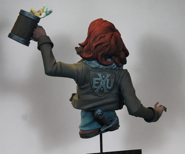
Rounding up a couple recently finished pieces. First, the most recent, is Vesha from Bold Miniatures. I had a blast working on this bust, just a really fun piece to paint. I started her with the intention of practicing female skin. But this also became a piece for me to focus on painting light. I tried to push myself to be bolder in my use of color in the primary light, working with Lemon Yellow for the highlights rather than just a subtler off white. I also played with adding blue to the shadows, though I know I could have been bolder with the color there. Finally this was the first piece I made a serious stab at painting cast shadows on.


The second finished project I wanted to share was Col. Elmer Ellsworth, a 75mm ACW figure from FER miniatures. I painted this piece as a gift for my dad, a Civil War buff and the person who first introduced me to miniature painting. I tried to take the lessons I was learning from Vesha and apply them on Ellsworth as well. Again I worked with a warm yellow light, which was interesting to paint onto the dark blue uniform. And I worked in cast shadows which you can see on places like his forehead from the hat, his shoulder from his head, and on his leg and shoe from the sword.


Tuesday, July 12, 2022

Sharki - Part 2

I've made some relatively quick progress on Sharki. I'm trying to keep a consistent lighting approach with the figure, so everything has blue in the shadows and yellow in the highlights, including the TMM with those same matte colors mixed into the TMM paints. I'm also working on cast shadows with this piece, so you can see those on the left leg (hook arm shadow) and then in numerous places in the front view image.


I'm planning to take a short break from this project so I can finish up my bust of Vesha from Bold Miniatures. But I hope to get back to Sharki right after that.

Monday, June 27, 2022

Sharki - Part 1

After working on a couple human-like figures (Frank von Stein, Vesha, and a historical I haven't posted yet), I felt like changing things up a bit and painting an orc. I have a couple unstarted kits from the original Big Child Creatives orc kickstarter. Those sculpts are all so full of character and fun to paint, they seemed like an ideal choice. After poking through my stash I settled on Sharki.

I'm practicing atmospheric lighting and cast shadows on this piece. I began by taking reference photos for the shadows which I highly recommend. I'll be working blue into all of the shaded regions for the ambient light and yellow into the primary light. Fun fact: no bottled green was used on the skin, just yellows and blues. The only colors used for the green were AK's Strong Dark Blue, WWI French Uniform Base, and Lemon Yellow.


Tuesday, February 1, 2022

Vesha Part 1

 Taking a break from orcs and monsters like Frank von Stein, I decided to shake things up with the half-elf Vesha, a bust from Bold Miniatures. My goal here, aside from painting a pretty model for a change, was to improve my use of light and shadow as well as work on my skin tones.

So far I've focused on the face and hair, then moved onto the weasel around her neck. The rest is just a sketch for light and shadow placement (though the fur around her neck has started to get a bit more refined). I just attached her left hand and it's only base coated so far. Her other hand has some very delicate figures which I'm sure I'll accidentally break while painting her, so I'm leaving that one off until the very end.

I've learned several things (or reinforced previously things learned) with this project:

 -  First, the importance of reference pictures. Especially if you want realistic light and shadows, take pictures of the figure under the desired lighting conditions.

 - Second, I need to be braver with my light color. While I understood the idea of using a specific colored light for the entire figure I would go with an off white rather than a more saturated color. I think I got too focused on making sure the highlights were bright and as a result they'd end up looking white regardless of the color I intended. On this figure I'm using much more yellow in the highlights with just a bit of white mixed in. I also need to switch to the highlight color sooner. If the skin tone paints get as light as the yellow before I start to add in the light color, it forces me to use more white to lighten it up. I think I was much more successful here getting those warm lights, especially on her skin. This is something I want to continue to work on with future projects and push for stronger effects with my lighting.

 - Third, working with colors in my shadows. The idea here is to bring in some of the ambient colors, in this case blue from the sky. You can see it most easily in the sketched on shadows in her shirt and the fur, though it's also in the coat, her hair, and her skin. I'm sure I could have done a lot more with the blue, especially in her skin. But this is still a step in the right direction and one I'll try to build off of on the next project.

 - Fourth, I'm starting to try to paint cast shadows with this piece. Yeah, there aren't any super dramatic cast shadows, but you should be able to see some under her nose, under the hair on her forehead and cheek, beneath the weasel's head, and on the back of the weasel. I'll continue on with them as I paint more of her. This is an area I've been tentative to try, but I'm glad I did on this project. While I'm certainly still learning, I can see the importance of making sure those shadows aren't too dark. They're still getting hit by ambient light, just not the main light source. This also means you should include the color of the ambient light in those shadows. And I want to balance the relative darkness of those shadows, so the shadow on the coat has the same step down in light relative to the base color on her coat as shadow on her face or on the fur beneath the weasel. The shadows don't need to be the darkest spots on the figure and making them too dark will look off. Save the darkest tones for areas that are blocked from the primary light and would also get minimal ambient light (like a combination of cast and occlusion shadows). And finally reference photos are extremely helpful in figuring out the placement of cast shadows.


Well, those are my main take aways from this figure so far. I plan to continue to keep those ideas about light and shadow in mind as I paint and refine the rest of the bust. But overall I'm very happy with how she's going.


Tuesday, January 18, 2022

Frank Von Stein - Part 2

Unlike the last project, this is a project I began in the past year and actually managed to finish it too! I was taken with this version of Frankenstein's monster from Terrible Kids Stuff as soon as I saw it. I liked the weird world war take on this classic monster character.


My goal with the project was to stick with a limited, desaturated palette. While I didn't want to simply paint him in black and white, I did want to bring to mind the look of those old monster movies with a limited use of color. Also, as Frankenstein seems to be associated with the color green, I worked a bit of desaturated green into all of my color mixes for the piece. It's not as obvious to my eyes when I look at the entire piece, but if I put it next to a neutral grey then the color shift is more apparent to me.


This piece also gave me another opportunity to make use of the 3D printer for basing. I didn't sculpt any of the background, but I created the basic plinth and wedge for the wall behind the figure. Then I took wall and floor textures from files I got through Print and Play Minis Deathburg kickstarter, clipped, and merged them in Blender to create the primary scene. The box came from Keta Minies kickstarter, also clipped to fit the scene. And the rats came from a recent release from Loot Studios (also clipped from a larger piece). I then added the electric cables using two different sized pieces of wire.


Here's a closer look at the skin. I really enjoyed experimenting with unnatural skin tones on this figure. You can check my first post on this figure to see the details of the color mix I used on the skin.


Onitsukaji Part 3 - Completed

I recently returned to this project from 2019. I was really happy with the start on this orc but got bogged down in painting the sash around his waist. Seems like a silly thing to get stuck on, especially since you can barely see it in most of the views below. But I found trying to paint the sculpted on texture to be a pain and it took away a lot of the joy from painting the piece.


But, I was looking for a project to use in a Secret Santa mini exchange and decided this would be a great subject. Plus I could use the extra motivation to get me through my painters block on this figure and actually finish him! 


After painting the figure, I took advantage of a 3D printer I'd picked up a little over a year ago to print out a few props for the base. While I've used it for a number of figures, I also really value the ability to resize and print scenery objects to fit whatever scale figure I'm working on. It's given me a lot more freedom to come up with more details for the scenes I'm creating.