
Painting
a nice subtle white can be quite tricky. Make it too bright and you
don't have any room to create highlights. Too dark and it will end up
looking like a light grey. Another thing to consider is
what type of white do you want to paint. A tend to shy away from a truly
neutral white. If I'm painting a fantasy or a historical figure I'll
almost never use a straight grey/white mix. Instead I'll rely on off
whites. For sci-fi and modern figures a grey/white mix might be
appropriate. But still consider your color choices and what effect you
want. Hopefully the examples below will help explain this better. Most
of what I'm using are Reaper Master Series paints. They're similar to
Vallejo but I like them a little more. If you're using a different
paint brand just try to find the closest colors to the ones I'm using.
While I've said I like to use off whites let's set that aside for the time being and begin by looking at a grey/white mix...
Hockey Goalie
As a modern figure a true white
makes sense here. For the most part I'm using three colors, Rainy Grey,
Misty Grey, and Pure White.


The Misty Grey is a very light grey,
so I use that as my base coat. I then roughed in the shadows by painting
pure Rainy Grey on the undersides of the folds. If there's a spot where
I need a really dark shadow I might go down one step further to
something like a Stormy Grey. I haven't used any yet, but will probably
work some in when I start on the legs. I then work up from the shadow
tone to my base coat by applying layers of Rainy Grey/Misty Grey, with
more Misty Grey in each layer. I cover up a lot of the pure Rainy Grey
with these mixes, not every shadow needs to be as dark as the pure Rainy
Grey. Once I hit Pure Misty Grey I then started working Pure White into
the mix. Now I'm working on the upper sides of the folds. While I work
in a lot of intermediate stages before pure white, they all cover a lot
of area. This helps keep the end result bright and white. When I get to
maybe 3 or 4 layers away from Pure White I start to drastically reduce
the area I apply these to get some highlights. The earlier you do this
the less bright the end result will be. But if you wait too long you
won't get any highlights and you'll lose some definition. And of course
all of the layers I'm doing are thinned so they are semitransparent to
help with the blending.
Scourge
For this figure I used a different white variation. I also wanted a big
difference between dark and light. So I worked from Dusky Skin up to
Pure White through a number of intermediate colors.


Now here I am working over black
primer, so I have a little more work to do. I start by coating the white
parts with Dusky Skin Highlight. Complete coverage isn't important, one
or two layers is fine. I then paint in leather white to differentiate
the light parts from the shadows (one or two layers is fine). Starting
on the shadow regions I put a little Dusky Skin in the darkest shadows
and then worked up to Dusky Skin Highlight. From there I worked up to
Weathered Stone, right up to the light/dark border I painted earlier. I
paused here to go back and fix up any of the shadow transitions that
needed more work. Now, on the light regions I started with mixes of the
Weathered Stone and Leather White. Followed by Leather White and Pure
White. And, once again, I went back over my transitions with
intermediate tones to fix any issues.
White Speaker and Gladiator
For a fantasy and a historical figure I turned to yet another variation.
These time using bone colors for my shading. Khakis would also be an
option.


For natural cloth whites I like using
brownish off white shades for my shadows. The same colors I used in the
goalie earlier would just look too artificial. For the White Speaker I
used a white primer and for the gladiator I used a black primer, either
can work. I did want the gladiator to be a little darker. A bright white
wouldn't fit here. So I took the shadows down a little further by
mixing in some Black Brown (09137) and then worked through that same
series stopping at Leather White. I didn't want anything too clean, so I
left out the pure white.
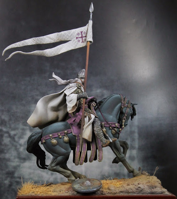
Knight
Although similar to the last two
figures I used a slightly different mix for this knight. I've used this
on the last few historical figures I've painted.
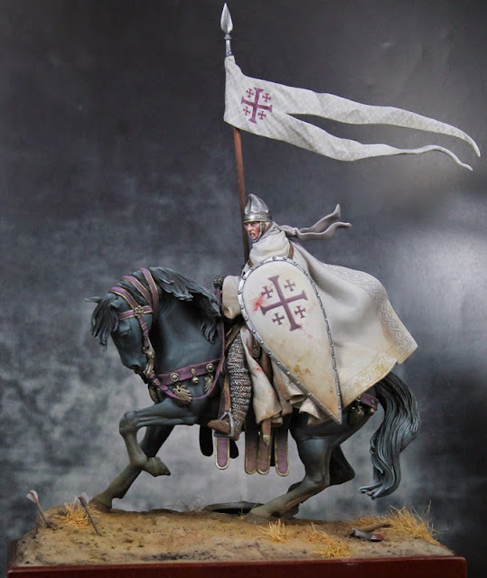
In the image below I've finished the
white on the knight's robes but I've only just roughed in the white on
the flag. You can see three of the colors above (bone shadow, weathered
stone, and leather white) on the flag indicating where I want to place
my shadows, mid tone, and highlight. You can also see that the
weathered stone is lighter than it appears in the above image, it
actually fits quite nicely between the bone shadow and leather white.
There are some areas on the robes and under the cape where I needed a
darker shadow so I mixed in a little black brown with the bone shadow.
There are also a few spots on the robe where I used pure white to
brighten the highlights. However I used both the black brown and the
pure white very sparingly.
Work in progress above where you can see the colors sketched onto the flag. Completed image below with all colors blended for smooth transitions.
Templar
And for the final example I used Vallejo paints:
German Cam Black Brown (822)
German Cam Beige (821)
Deck Tan (986)
White Grey (993)
The Black Brown was using very
sparingly, only for the deepest shadows. The majority of the shadows
were a mix of the Beige and the Deck Tan. Then working in stages up to
pure White Grey. Here's another case where I wanted a bit of a dirty
white, so I stopped at White Grey. If I wanted something cleaner or
brighter I'd keep going up to pure white.
So several variations on white but the general idea remains the same.
Experiment with off white colors, don't just use grey unless that's
really the look you're going for. Use a color close to white but avoid
pure white except for the highest highlights. And lastly take your time
with those blends so they are smooth. I tend to paint from shadow to
highlight but in areas that need help with the transitions I will go
back and forth over several times to get everything smoothed out.
A Note on Photographing White
So now you've mastered painting white, what about photographing your figures? This can be a bit tricky if your figure is mostly white. Unless you're using an SLR with manual exposure, your camera is going to try to select the correct exposure for you. The camera's light sensor expects that everything in its field of view will average out to a medium grey. This works in many cases, but will result in a very light or mostly white figure being underexposed. It will also cause a very dark or mostly black figure to be overexposed. But many cameras allow you to adjust the exposure up or down. If you know the figure is light, you might set the exposure to +1/2 or +1 to compensate. If the figure is dark, try -1/2 or -1. Some camera's have an auto bracketing feature where it will take three photos, one at what it thinks is the correct exposure, one slightly underexposed, and one slightly overexposed. This allows you to select the correct one. If your camera does not allow you to adjust the exposure, there are still things you can do. One would be to select a different background for your photo. Remember, the camera looks at the average amount of light and dark and expects medium grey, so a very light figure with a very dark background should help you get the correct exposure. This requires some experimentation to get right, but can work.
There are a lot of factors that go into what the correct exposure is for your figure (the colors of the figure, the lighting, the colors in the background, etc). The important thing is to be aware of what the camera is trying to do and work with it to get a photograph that is as close as possible to what you see in real life. If your photos are coming out too light or dark, adjust the exposure and retake them until you get a result your happy with.
Thank you for this guide, i love white and this helped me get that one effect i wasn't able to create
ReplyDeleteThanks for the guide. Fantastic stuff and very informative. I appreciate the different variations of white you presented. You totally should do some YouTube videos so painters like me can see your process in action. That would be amaxing helpful! Thanks again for sharing and keep up the beautiful work!
ReplyDeleteI love this guide! Thank you!
ReplyDeleteGreat job and great advice. Too bad most of the photo links seem to be broken.
ReplyDelete