Tuesday, June 20, 2017

Redghar Returns! Pirate Orc - Part 5

It's been almost a year since I've done any painting on Redghar.  As often happens, I get to a point on a figure where I'm not quite sure how to move forward.  So I set it aside, work on other projects, and come back to it when I've had a chance to come up with a solution.  With Redghar my issue was the leather parts.  I find leather is tricky because you're painting texture along with highlights and shadows, so it's not something I feel 100% confident with (though I feel I'm getting a better handle on it).  However, my issue here was more a matter of color.  I did not feel the tradition brown-yellow leather colors would look good with the color palette I'd been using for the orc.  So I put this project on hold until I could come up with a mix I liked.

As often happens, my work on a different project ends up helping me figure out how to do a different one.  In this case it was my work on the Orc Brave.  I mixed some basic browns with the teals I used in his skin, creating a dull (slightly greenish) brown that I thought would work well on Redghar.  I made one further modification, mixing Burgundy Wine into the shadows (since that is the shadow tone used on the skin, red sash, and purple parts of the orc).  The mix for the brown leather was...
Shadow: 50/50 Walnut Brown and Burgundy Wine
Midtone: 60/40 Basic Dirt and Marine Teal
Highlight: 90/10 Terran Khaki and Surf Aqua
Top Highlight: Vampiric Shadow

I used this for the leather plate cover his waist.  For the belt on top of the sash, I decided to do a black leather.  The approach for that came from seeing Ben Komets' work on his Uther bust.  There were some nice black leather portions on there.  My version used a mix of Black and Marine Teal as a substitute for the Dark Sea Blue.  Highlights were done with Vampiric Shadow.


From there, I continued on with the leather work and tackled the strap around his chest.  Like on the belt, I tried to bring out the cracks and scratches.


Here are a couple close ups.  You can click on them for the full res version.


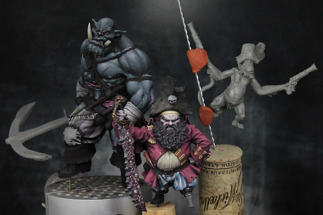
So, with Redghar back on track, I put some more thought into what I plan on doing with him when I'm finished.  For a while now I've been tempted to pair him with the dwarf pirate (another figure I'd almost finished).  Though they are from different ranges, I thought they fit well together.  You've got the diminutive captain and his big enforcer. I wanted to create a diorama of a pirate crew, but felt they needed a third crew member.  I had a few ideas, but nothing that seemed perfect.  After some more thought, I decided I will use one of the monkey's from the Black Sailors line (where Redghar is from).  That figure will need some converting.  I'd like to reposition the arms, legs, and tail.  But, I think that's within my abilities.  If I screw it up... well, the monkey wasn't that expensive a figure to begin with.  I did a quick mock up of how I think the scene will look.  Redghar and the dwarf will be on the deck of the ship and the monkey will be hanging from the rigging (pointing his gun off towards the right).

I'm going to redo a decent amount of the dwarf to bring him in line with Redghar.  The contrast isn't bad, but I wasn't pushing it as far as I am on the orc.  I'm sure it will be a while before the whole scene is done (I do need to get back to the Orc Brave soon to finish that piece up).  But I think this piece could be done in time for Adepticon and Crystal Brush.  I don't expect it to win in an ultra competitive category like Diorama... but if I can just make the cut I'll be very pleased.


Monday, June 5, 2017

Knight Part 1

I was getting a bit burnt out on the orc project. All the little details on the clothing take time, but you don't feel like you're making much progress. I could feel myself starting to rush things, so I decided to step back and work on something else for a bit. In a few weeks I can return to the orc hopefully refreshed and finish it at the level it deserves.

Anyway, the new project is a 54mm knight from Romeo Models. I'd recently happened across some reference images that will serve as the inspiration for the piece. I'm hoping to do a lot of design work on the clothing and the shield. In these early stages I have delusions that I can paint like Bohun or SkeletteS. Soon reality will kick in and I'll pick a simpler design that I can actually pull off. After all, this figure is 54mm, not 90mm like the samurai I did. But you can't improve by always playing it safe, so I hope to push myself on this one.  I plan to write a full step by step tutorial on this project, so check back for more information on that later.  In the meantime, I'm sharing some previews of the sort of information that will be in that below.


I began by base coating the majority of the figure.  You can already see the influence of the above images.

The majority of my work so far has focus on the face. The fact that a good portion of the face was covered up actually made it more challenging. Had to get as much detail in the small section that was there as I could. Here's a breakdown of each step...

Image 1: Base coat of the face and surrounding regions. The face is a 50/50 mix of Reaper Master Series Bronzed Shadow and Rosy Shadow.

Image 2: I like to sketch in the shadows. For this I used Reaper's Chestnut Brown (for most of the shadows) and Mahogany Brown (for the darkest shadows). In each case I mixed in maybe 20% of the base color. I'm focusing on the area around the eyes, nose, and cheeks.

Image 3: After getting the rough shadows around the eyes, I pause to paint the eyes themselves. I used an off-white (Reaper's Weathered Stone) and then just a very dark brown (Walnut Brown) for the iris/pupil. On a larger scale I will paint a distinct iris and pupil, but for 54mm and smaller, a single dark dot (either dark brown or dark blue) tends to work well enough.

Image 4: I now return to the skin and using a number of layers blend the shadows into the midtone. I start with the shadow tones (plus 20% of the base) and gradually add more and more of the base color with each layer. I smooth out the shadows, leaving the darkest tones just where I want them.

Image 5: I continue on with the highlights. To the base, I gradually add a 50/50 mix of Bronzed Highlight and Fair Skin. I'm working farther and farther away from the main shadows. Highlights are focused on top of the cheeks, the browns, upper mouth, and the parts of the nose not hidden by the helmet. At the very end, I add a bit of Linen White for the top highlights. Just on the top parts of the cheeks and a dab on the nose.

Final Step: Not shown yet as I need to paint the surrounding areas. Once those are down, I'll return to the face and use some red and blue glazes to add color variation. The red glazes will be applied to the sides of the cheeks to make them appear a bit more rosy. The blue glaze will be applied above the mouth to create the look of stubble. Check back as I will post those images as soon as I've competed that part of the figure.

You can click the above image for a larger view.

I also put together a look at how I start the design work.  While I have much more complex plans that just a stripe, even the simple stuff needs to be done carefully or else you will run into trouble when you start to build on top of it.  So as I begin the simple stripe along the bottom of his surcoat, I create an improvised ruler from the corner of a piece of paper to help me measure the size.  Using a marker I indicate how large the stripe will be.

Then I hold up the paper next to the figure and place small dots all along the bottom of the surcoat.

After that, I carefully paint a line between the dots.  I can again use the paper to check various parts of it to see if everything is the right size.

Finally I fill in the stripe.  I'm not worried about the border being completely clean.  I will fix that when I go back and highlight/shade the two colors.  The important thing is that I'm beginning with a stripe of uniform width all along the bottom of the surcoat.

There will be more work to come on top of the stripe.  But, you will see, the basic procedure of measuring and marking out guide dots will be used to create more and more complex designs.