Showing posts with label SBS. Show all posts

Tuesday, May 30, 2023

Class Figure (Gurkhan) Part 4

 I got back from KublaCon the other day and had a blast at the show. I had a workshop on painting large scale figures using Gurkhan which I think went really well. It's such a fun figure that can be used to discuss a lot of topics (lighting, skin, leather, cloth, metals, etc). I'll be teaching with it again at NOVA Open in DC this Aug/Sept. That class will be a bit longer (6 hours instead of 4), so we'll be able to go even more in-depth in some areas.


I also entered this piece into the KublaBrush awards and got the Big Child manufacturers award for the best Big Child piece at the show. There were quite a few Big Child pieces entered and I thought David Diamondstone's painting on their Idril bust was particularly nice. So I felt very fortunate to end up with the win. I also took my Vesha bust which ended up winning Best of Show.


Getting back to Gurkhan, I wanted to share the version I brought to the show. I could say finished version, but since I was trying to get all my class figures prepped, I ended up being pretty rushed to finish the base. Since I plan to bring the piece along with me to NOVA too, I'd like to send a little more time refining the work on the base and maybe adding a bit more detail in spots. But I think these images still give you a pretty good idea how the finished piece will look.


One of the topics I discussed in the class (and plan to spend time on at NOVA too) is creating focal points on your pieces. There's a lot of detail on the sculpt, a lot going on, so how do you help the viewer focus? One way is by using brightness. If we strip away the colors and just look at the light, you can see there are some brighter spots in the piece that draw your eye and create some focal points in the scene. I tried to also use color to reinforce this, so you've got multiple things helping direct the viewer around the scene.


I might take a little break and try to finish up my Neko Galaxy project (Nancy) from a few months back. But I don't want to leave this sitting too long, as I'd like to get the quality of the base in line with the quality of the figures before NOVA.

Wednesday, May 17, 2023

Class Figure (Gurkhan) Part 3

Work has kept me pretty busy this past month, so I haven't made quite as much progress on my painting projects as I'd like. So, with about a week and a half left until KublaCon, I'm working hard to get my pieces finished. The Gurkhan figure itself has been pretty much finished for a few weeks, but I wanted to create a little more of a scene around him. I thought I'd pair him with another figure from Big Child Creatives that I've had hanging around my collection since their first kickstarter. I liked their size difference and felt the poses worked well together. I picked a similar color scheme for the new figure, though leaning more heavily on the purple than the orange to help balance out the colors overall. I also went for a slightly different skin tone, introducing some Command Green and Grey Green into the shadows and midtone respectively. Just as skin tone can differ from person to person, I wanted to introduce a little variation between these two.

The base is certainly still a work in progress with just a simple first coat applied to get a sense for the colors. The scene is 3D printed. I mainly used the ship model from Loot Studios and clipped it down to a small section that would fit the 70 mm by 70 mm base. Then I added a few elements to go alongside the chest, representing some supplies they picked up (stole perhaps) and have now brought on board. Some of these are also from Loot and some are from Keta Minies.

I have some other work to do in order to prep for all my classes at the show, so I'm getting low on time. But I'm sure I'll find a way to get the base painted along with all the other stuff I have on my list.


Just for fun, here's a little comparison of the two figures from when the 2nd guy was mostly a base coat (plus some early shadow work on the face) and where they are now. I remember in my early stages as a painter I struggled with online images trying to understand what was just the lighting of the photos and what was actually painted. So I find these side by sides helpful as you can see the piece under the same lighting conditions (as you can see from the other figure) before and after the painting of highlights and shadows.


Monday, April 17, 2023

Class Figure (Gurkhan) Part 2

 I'm trying to make quick progress on this class figure that I'll be using at KublaCon and NOVA Open. I'd like to have the painting on the figure itself done by the end of the month, so I have plenty of time to work on a base for him before KublaCon.


I've done a lot of the leather work recently, focusing on texture as well as light. While I intend to keep the class schedule flexible, so we can touch on the topics based on the interests of the students, I except leather and textures will be something we'll discuss. I spent some time on the chest yesterday and still need to finish the metal portions on the sides and back. After that I want to tackle the basket on his back. Then I'll finally feel comfortable attaching his other hand and not feeling concerned I'll accidentally knock it off while painting the other sections of the figure.


Monday, April 3, 2023

Class Figure (Gurkhan) Part 1

 I'm going to be teaching classes a KublaCon and NOVA Open this year. I'm covering topics on painting faces and skin, introduction to freehand work, and a longer class on painting 75mm display figures. For that final class I picked Gurkhan, an orc from Big Child Creatives, as the subject. I love the Big Child Creatives figures in general, so I'm excited to use one for a class. That all have so much character and are a lot of fun to work on. I picked this one in particular since it gives us the flexibility to cover a number of topics such as skin, cloth, leather, weathered metals, etc depending on the interests of the class and how much time we have. It's also a figure I haven't seen many versions of online, so we can explore something somewhat new.

While I'll obviously be painting one live at the class, I also wanted to paint a version beforehand. I think it's nice to have a finished one there for reference and what can be done when you have longer than a single class to work on him. And I can also work out some of the kinks before teaching the class. It's rare that I'm every happy with all parts of a figure on the first attempt. There's often areas that I will paint and, when I step back to evaluate, realize aren't working quite like I hoped. So I'll go back in and make adjustments. Better to learn those lessons at home so I can make the most of the time I have in the actual class!

Here's a quick look at the class figure about halfway done. I'm having a lot of fun painting him and am very excited for the classes!


You can find and sign up for my classes at the links below. The NOVA classes are about half full and the KublaCon ones just went live, so spaces are still available at each.

https://tabletop.events/conventions/nova-open-2023/schedule#?query=powell

https://tabletop.events/conventions/kublacon-211/schedule#?query=powell

Monday, November 21, 2022

Nancy (Neko Galaxy) Part 2

 October was a busy month, so not much painting happened. Things have started to calm down a bit, so I got back to painting over the past few days. I thought I'd share an update on Nancy from Neko Galaxy. She's different from my usual subjects, but that's made for a refreshing change. Plus she's just a fun figure, so how could I not enjoying working on her?

After painting the skin and body suit, I moved on to the hair. I tried to play up the shine effect with light reflecting off her hair. I then moved on to her armor. I'm taking more of a NMM approach on this one instead of my usual TMM. I feel like I've been slowly moving in the direction of NMM anyway. I still have some of Scale75's Heavy Metal in my mix, so the metal portions have a slight reaction to the light as you move the figure. But there's a lot of matte color mixed in, so the shadows and shine are pretty much frozen in place.

I started with a 1:1:2 mix of Strong Dark Blue (AK), Amethyst Blue (AK), and Heavy Metal. This formed my core shadow (steel mixed with a dark violet blue). Then I worked up to ~3:1:1 mix of Heavy Metal, French Uniform Base (AK), and Violet Light (RMS). This worked as my metal reacting to the ambient light. Then I shift to a 2:1 mix of Heavy Metal and Lemon Yellow (RMS), for my basic highlight. Then I introduced pure white to that for the top reflections. And, to some of the mid range mixes, I added carnage red so I could pick up some reflected light from the painted portions of her equipment.


Monday, October 3, 2022

Nancy from Neko Galaxy and Painting Skin

I just started on Nancy, a 75mm figure from Neko Galaxy. I've been focusing on improving my use of light and my skin work lately, so I thought I'd share some details of my approach for this figure.


I've been painting cast shadows on my last few projects and I find taking reference photos to be a huge help in making sure my cast shadow placement looks believable. A simple way to do that is to take the unpainted figure and place it under my painting lamp. I can then move the light around until I find an angle that I think works well with the figure. Be sure to keep in mind what your intended 'front' view for the piece will be when you picking your light placement!


For this piece I ended up taking two different series of reference photos, one with the unprimed figure and one after I'd primed her. Why? Well, on the unprimed figure you get more of a semi-gloss reflection off the bare resin. I wanted to create a similar shine when I painted the skin, so the unprimed pictures help me place those reflection points and understand their shapes. Now these reflections will change depending on what angle you're viewing the figure from, but if you stick with whatever view you think is the front, you should be fine. The second set is after priming. The figure now has a matte finish so it's a little easier to isolate the shaded vs lit regions. You can still get that information from the first image, but I think it reads clearer in the second. 


Jump forward to the painted figure and you can see the placement of shadows on the skin based on the reference photos as well as the reflection points. Of course you don't need to match them exactly, you can use your artistic license to make adjustments. For example, I've maybe pushed the shadows a little further towards the side on her face to keep it well lit. And I've added some small reflections to bring out the knees more. But overall I've stuck close to the reference photos and used those to help guide me as I painted.


As for colors, I recommend not getting too caught up in specific paints. You don't need this particular shade of red from this particular brand of paint to get similar results. Rather focus on the colors themselves (that blue was used here and yellow there, whether the colors are light or dark, saturated or desaturated, etc) and pick similar shades from whatever brand you prefer. Okay, end of disclaimer! ;D


I've got a mix of Reaper and AK Interactive paints. For a base, I used a 50/50 mix of Reaper's Rosy Shadow and Fair Skin. The darkest shadows were Reaper's Ruddy Leather mixed with Imperial Purple, Void Blue, and Rosy Shadow (something like 2 parts Ruddy Leather, 1 part Imperial Purple, 1 part Rosy Shadow, and a touch of Void Blue). Normally I'd substitute the blue for purple, but I wanted a more violet ambient light for this scene and hence the change. If I needed anything darker, I'd use the same mix but remove the Rosy Shadow and add in more Purple and Blue. From that shadow mix, I'd work in layers up to pure Rosy Shadow and then continue on until I reached the 50/50 Rosy Shadow and Fair Skin mix. For the highlights, I then began to add a 2:1 mix of Reaper's Lemon Yellow and Linen White into the 50/50 Fair Skin and Rosy Shadow mix. I wanted a yellow feel for my primary light source but if I worked up to pure Fair Skin first, that color would be about as light as the yellow is and thus it'd no longer work for the highlight. So I begin when I've still at 50/50 Rosy Shadow and Fair Skin.


For the reflection points on the skin, I started to add Pure White to the highlight mix but prior to reaching pure Lemon Yellow/Linen White. I liked the results better when I switched over to adding white while there was still some skin tone in the mix. 


Using the same approach as above, I also added red to the shadow tones and midtone (darker red into shadows, lighter red into midtone) and used that variation in areas like the nose, cheeks, and knees. However, I kept the same highlight mix rather than adding red there too. I then use intermediate mixes between the red variant and the main skin version to blend the transition regions. You'll see I still need to do some adjustments around the knees.


For the body suit, I switched over to mostly AK Interactive paints just because those are the shades I had handy. The base was AK's rock grey, a warm grey. For the shadows, I took a bit of Amethyst Blue and Strong Dark Blue (50/50) for a nice dark violet which will be used throughout the rest of the figure. I added some of that to AK's Neutral Grey. I began with that grey-violet mix for the darkest shadows and then gradually worked up to almost pure grey. I wanted the body suit to look white, not purple, so I tried to find a balance between adding in some of the ambient color without so much that it overpowers the primary color for the suit. Into the mix of mostly grey with a little violet, I then added Rock Grey. When I reached pure Rock Grey, I then started to add my Lemon Yellow and Linen White mix. Since the base color here was already pretty light, I switched up the highlight to a 1:2 mix of Lemon Yellow and Linen White (more white than yellow).


I'm debating if I also want to add pure white reflection points on the body suit to give it more of a shiny look. I'm going to hold off for now and wait to see how things look with the metal portions done. Speaking of which, the armor is based coated with that dark violet mix on areas that will eventually be metallic. Then there will be regions of painted metal, which I've based with a 50/50 mix of AK's Burnt Red and Medium Rust. I'm sticking close to the original concept art, but swapping the yellow in those for red just to make mine a bit different.


Monday, August 5, 2019

Starting a new project

While this post will (hopefully) be a preview of an upcoming project, it's also going to discuss my process on what I look for and think about when I begin a new piece.

Lately I've felt like I'm in a bit of a rut with my painting. I've got a piece I'm painting, but seems like each section I do I find I'm not happy with and wind up redoing it. So it feels like I'm not getting much done. The other day I decided it might be best to put that piece on hold for a bit and start something new to hopefully recharge my mojo.

I've been searching through my collection of kits to see what sparks my interest. There's a lot of neat figures but these days I look for a couple things in any new project...

1) What can I do that hasn't been done before? With the forums, Facebook groups, instagram, etc you've likely already seen several versions of any commercial kit. And often you'll find some really amazing versions painted by some of the pros. So how do I make my work stand out from the rest? How do I make it memorable? Well, I try to find a way to do something new with the figure. It could be as simple as a new color, but I typically aim for a bit more. Perhaps I can interpret the figure in a different way. I think of the fallen angel piece I did a while back. The figure was intended as a 'good' angel. But with a different color scheme and setting, it became more of a demonic entity.

Another way to do something different is to pair two or more figures together. A lot of people may have painted figure A, but has anyone ever paired it with figure B? That helps to create a unique scene when you pair two figures that weren't initially designed to go together. Of course the figures have to work together for the piece to be successful.

Tied into all of that is the story behind the piece. These days I try to come up with some story, some setting for the figure beyond just 'hey, here's a neat figure standing in a field.' I've done my fair share of figures on ground, but if you can make the scene something more that too helps it stand out. The stronger the story, the more memorable the piece will be.

2) What can I learn from this piece? No matter how good you are, there's always room for improvement. Since I first got into display and competition painting, I've had a mental list of topics I wanted to work on. On that list has been painting textures (leather, etc), TMM, weathering, base work, greater contrast, color variation, etc. I usually pick one or two topics and attempt to improve those with whatever project I have planned. At the moment, high on my list is working with light. That includes aiming for more interesting and complex lighting conditions (like I did with my recent Hera Models orc bust) and introducing ambient light and how light reflecting off one object can influence the color of another. Other topics on my current list are color schemes, composition, compelling base work, more multi-figure scenes, and probably more if I continue to think about it.

3) Does it spark joy? Okay, I'm not really a follower of Marie Kondo, but I do what a project to be fun. So, simply put, am I excited to paint it? While the first two topics are things I hope to be able to work on with any project, this last one is a must!

For the near future I'm not able to travel to any shows/competitions. But, if there was a show I planned to attend in the next 6 months or so, I'll also weigh whether or not that new project could be entered there.

And there you have my general thought process as I look for new projects. I will say, as of late, I feel like I've been putting more pressure on myself with my new pieces. I've always tried to make each piece better than the last because that's how I continue to improve. But lately I feel like I have a standard that I have to live up to. So when a project isn't as good as I want it to be, it can be very discouraging. While I do want to continue to grow and improve, painting is also an outlet and a way for me to relax and enjoy myself. At the moment I feel like those two aren't quite in balance. I'm not exactly sure how to fix that, but I'm hoping a new project will help.

So... what's next on my to paint list? I've been digging through my collection this past weekend and I think I've finally settled on Onitsukaji from Big Child Creatives. It's a fantastic sculpt with a lot of character. And I also really enjoyed painting Redghar from their first kickstarter, so I'm hoping this will feel similar. To address some of my questions for any new project... what can I do with Onitsukaji that hasn't been done before? One thing that came to mind is to put him in a multi-figure scene (which also hits one of the topics on my list from #2). I've been sitting on Bocanegra since the first kickstarter, knowing that I wanted to use him in some scene. I think he could work with Onitsukaji and I really like the size juxtaposition between these two.

I did a mock up of how the two might look together and took a few pictures:
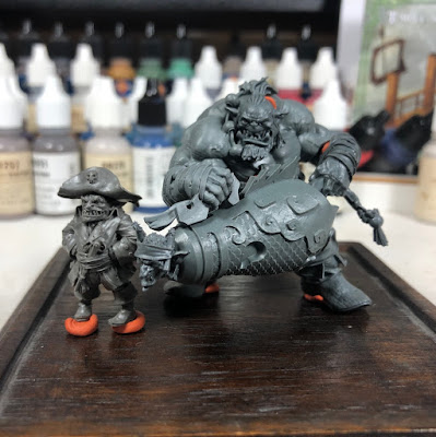


At this point I'm starting to brainstorm a story for them. Why are they together? What are they doing? Bocanegra clearly has a pirate look, so the story should have something to do with that. Onitsukaji to be about to shoot someone or launch that goblin at something. That certainly gives me stuff to work with. And it doesn't need to be the most intricate and detailed story. But are they standing on the edge of a ship about to shoot at a ship they're planning to raid? Maybe they've come off the ship and are at the gates of a town, threatening to blow their way in. I'm still coming up with ideas. But, when I finally settle on the one I like the best, that will help me figure out how the scene should look, what elements I should include in the base to help convey that story. I also need to come up with a color scheme for the pair and what sort of lighting conditions I want to use in the scene. Knowing the story and setting might also help me figure out those details.

I should say that I don't always do so much planning. Sometimes it's good to just grab a figure, start painting, and figure out everything else later. But, more often than not, this is how I will approach any new project. Hopefully it provides some helpful insights!

Tuesday, May 29, 2018

Mollymauk Part 4

I was out of town for a few weeks, so I had to put this project on hold.  But now that I'm back, I've started working on the next big task, his coat.  Following the character art, this will be covered in designs.  Since most of those designs are made up of lines (rather than large solid areas), it made the most sense to paint and shade the background color fully before adding the design details.  The only exception was a large thick stripe down the center of his back.  That was done prior to shading/highlighting the red.

Since I was dealing with a large area, I began by sketching in the shading.  I used 5 color mixes: the shadow, midtone, and highlight along with colors halfway between each of those).  I then returned to this roughed in version and could focus on blending between the colors.  I used my typical layering approach, but just focused in the area where those shades would be.  This saves time by not repeatedly painting over the same spot with shades that would just get covered up later.

After that was done, I started layering on the designs.  The coat will be covered with them, so I still have a way to go.  I started with the main elements.  Their size and placement will affect how the rest is done.  I'll likely find some details won't quite fit, so I can either simplify or squeeze out some of the smaller bits.  Here's a look at how he's coming along...


Here's a quick look at how the some of the design work was done.  It's my usual process for geometric designs.  I started by taking a scrap of paper and marking the distance from the center of the circle to the outside and then a second mark for the distance to the end of the arm (triangle).  I placed a dot for the center of the circle and then held the paper at different angles to mark dots along the outside of the circle and at the end of each arm.  Instead of trying to freehand a circle, I could follow the dots to keep it much closer to a true circle than if I'd just eyeballed it.  I then went about thickening up that line (first image below).  Next I painted on radial lines for the arms.  Then I went about placing more guide marks around the circle, two evenly spaced between each arm.  These were close enough that I did just eyeball it (though if you wanted to be real precise you could measure that too).  Then I painted in the lines connecting these marks with the ends of the arms (image 2 and 3).
Next I had to add the squiggly triangles in between.  I started with a short line between each triangle, done at a slight angle (image 4).  Then I went back with a stretched 'C' shape (image 5).  Finally I painted the lines on either side, letting the existing curve help be my guide (image 6).

With all these sorts of designs, it's about breaking it down into simpler parts and slowly building up the complexity.  By also measuring, you keep distances consistent and get something that looks more like it was printed on and not hand painted.

Monday, March 5, 2018

Templar Sergeant Part 2 and Video Tutorials!

Over the weekend I began painting the templar and managed to record a series of video tutorials showing how I painted the face.  Doing video tutorials is definitely a learning process.  Nothing fancy here.  No editing, no time jumps, no sped up sections, etc.  Just the entire painting process from start to finish and me trying to explain it all as I go.  I broke the videos up into 6 parts covering specific sections.  All in all, painting the face took me about 2 and 1/2 hours.  But with the explanations and introductions, the total video length is 3 hours.  It's a lot to sit through.  Thankfully you can skip around and just view the parts that are most important to you.

You can find all of the videos (and all of my future ones) here.  But I have also linked all of them below.

Part 1: Prep and Sketch

Part 2: Eyes

Part 3: Shadow to Midtone

Part 4: Midtone to Highlight

Part 5: Lips and Eyebrows

Part 6: Glazing

Monday, June 5, 2017

Knight Part 1

I was getting a bit burnt out on the orc project. All the little details on the clothing take time, but you don't feel like you're making much progress. I could feel myself starting to rush things, so I decided to step back and work on something else for a bit. In a few weeks I can return to the orc hopefully refreshed and finish it at the level it deserves.

Anyway, the new project is a 54mm knight from Romeo Models. I'd recently happened across some reference images that will serve as the inspiration for the piece. I'm hoping to do a lot of design work on the clothing and the shield. In these early stages I have delusions that I can paint like Bohun or SkeletteS. Soon reality will kick in and I'll pick a simpler design that I can actually pull off. After all, this figure is 54mm, not 90mm like the samurai I did. But you can't improve by always playing it safe, so I hope to push myself on this one.  I plan to write a full step by step tutorial on this project, so check back for more information on that later.  In the meantime, I'm sharing some previews of the sort of information that will be in that below.


I began by base coating the majority of the figure.  You can already see the influence of the above images.

The majority of my work so far has focus on the face. The fact that a good portion of the face was covered up actually made it more challenging. Had to get as much detail in the small section that was there as I could. Here's a breakdown of each step...

Image 1: Base coat of the face and surrounding regions. The face is a 50/50 mix of Reaper Master Series Bronzed Shadow and Rosy Shadow.

Image 2: I like to sketch in the shadows. For this I used Reaper's Chestnut Brown (for most of the shadows) and Mahogany Brown (for the darkest shadows). In each case I mixed in maybe 20% of the base color. I'm focusing on the area around the eyes, nose, and cheeks.

Image 3: After getting the rough shadows around the eyes, I pause to paint the eyes themselves. I used an off-white (Reaper's Weathered Stone) and then just a very dark brown (Walnut Brown) for the iris/pupil. On a larger scale I will paint a distinct iris and pupil, but for 54mm and smaller, a single dark dot (either dark brown or dark blue) tends to work well enough.

Image 4: I now return to the skin and using a number of layers blend the shadows into the midtone. I start with the shadow tones (plus 20% of the base) and gradually add more and more of the base color with each layer. I smooth out the shadows, leaving the darkest tones just where I want them.

Image 5: I continue on with the highlights. To the base, I gradually add a 50/50 mix of Bronzed Highlight and Fair Skin. I'm working farther and farther away from the main shadows. Highlights are focused on top of the cheeks, the browns, upper mouth, and the parts of the nose not hidden by the helmet. At the very end, I add a bit of Linen White for the top highlights. Just on the top parts of the cheeks and a dab on the nose.

Final Step: Not shown yet as I need to paint the surrounding areas. Once those are down, I'll return to the face and use some red and blue glazes to add color variation. The red glazes will be applied to the sides of the cheeks to make them appear a bit more rosy. The blue glaze will be applied above the mouth to create the look of stubble. Check back as I will post those images as soon as I've competed that part of the figure.

You can click the above image for a larger view.

I also put together a look at how I start the design work.  While I have much more complex plans that just a stripe, even the simple stuff needs to be done carefully or else you will run into trouble when you start to build on top of it.  So as I begin the simple stripe along the bottom of his surcoat, I create an improvised ruler from the corner of a piece of paper to help me measure the size.  Using a marker I indicate how large the stripe will be.

Then I hold up the paper next to the figure and place small dots all along the bottom of the surcoat.

After that, I carefully paint a line between the dots.  I can again use the paper to check various parts of it to see if everything is the right size.

Finally I fill in the stripe.  I'm not worried about the border being completely clean.  I will fix that when I go back and highlight/shade the two colors.  The important thing is that I'm beginning with a stripe of uniform width all along the bottom of the surcoat.

There will be more work to come on top of the stripe.  But, you will see, the basic procedure of measuring and marking out guide dots will be used to create more and more complex designs.

Monday, March 6, 2017

New Tutorials

I've got several new tutorials up on FigureMentors.  Here's a list in case you're interested in checking them out:

Painting a Shiny Black (with Matte Paints)
The most recent work looking at how I did the black sections on the Dragoon and the hair on the Fallen Angel

Step by Step Painting of a 54mm Saxon Warrior
This is an older project, but I only recently got around to writing it up.

Knight of the Holy Sepulchre
A summary of my work on this.  Not a true step by step, but still an in-depth look at the project.

A Reference on Crusading Knights
Not a true tutorial, but a good summary reference for anyone interested in painting crusaders.

Wednesday, October 26, 2016

Germanic Knight Part 1

Sorry for the long gap in posts, I haven't had much time to work on figures recently.  It will probably continue to be like that for the next few months, so updates will be sporadic.  Since I'm having a hard time finding more than an hour at a time to paint (sometimes less than that), the Count Melenth project is getting put on hold.  The OSL on the body is tough and I really need 3-4 hours to just sit and work through it until I figure it out.  I just can't make much progress on that piece with these short painting sessions.  So, I decided to start on something else that would work better for the time I've got.  I decided to go with a knight from FER miniatures.  It's a great sculpt and cast, so should be fun to work on.  This should give me a chance to work on metals, leathers, and freehand (for the clothing and shield).  I started with the freehand and I thought I'd show you my process.  Hopefully the amount of information in the write up will make up for the lack in frequency in posting them!

A while ago I'd ordered a table mounted vice. Normally when I do design work I'll start by adding little dots as guides. Unfortunately I need one hand to hold the ruler, one hand to the hold the brush, and one hand to hold the figure... that's one hand too many. This was a huge paint when I tried to paint the samurai. But, with the table mounted vice I can free up a hand and that makes this early step so much easier! I was able to reposition the figure at different angles and work my way around it. I used a scrap of paper with the spacing marked on it and added dots around the figure (second image). When that was done, I connected the dots to form the borders for the edge design (third image).

I needed a design for the chest.  I decided to use a double headed eagle.  I like that image and haven't done it before.  I looked around online for references and found quite a few different versions of the eagle.  I settled on this one since it's a neat one with plenty of detail

To transfer it to the knight, I created a simplified version to start.  I had previously drawn a vertical line down the center of his chest.  This served as a guide for where to place the eagle.  Measured the height of the shoulders of the eagle (roughly halfway between the top of the heads and the top of the tail) and place a horizontal line on the knight where I thought those should fall.  I placed dots for the location of each eagle head (measuring the distance from the center line so they're spaced properly).  I did the same for the wing tips.  I then created a very rough version of the eagle design.

Once I was happy with the roughed in version (the size, proportion, location, etc), I started to fill it in and add a few more details.  While doing that, I rough in the shadows on the design as well (following the locations of what I'd previously roughed in).
And then the wings...

The design is by no means finished, but I've got the main idea of what I want to paint on his chest.  At this point I start to paint and shade the background (the bulk of his clothing).  This figure will have a black design on top of a white surcoat, so I started with the white.  Right now I'm just focusing on this chest.  Normally I'd do all the white together, but with the limited amount of time I'm breaking it up into small pieces which work better for those short painting sessions.
You'll notice that the white background made the design fuzzy, obscuring the clean edges from before.  That's fine.  The next steps will have me going back over the design to do the full shading and highlighting on it as well as adding further details and refinements.  What I've got here is meant to be a guide for the next step and not the final design.

An important question: why did I rough in the design before shading the background?  Well, I could certainly have done that first and then painted the design on top of it.  The reason I didn't is that I planned to use white with a high level of contrast for the background.  Getting smooth blends takes time and lots of work (layers).  Why waste time getting a nice smooth blend in an area that will be covered up with another color?  By roughing in the design first, I save time and effort by only painting/shading the background areas I need to.  I will have to go back and clean up the edges of the design, but that's a much quicker task than shading all of that white.

Saturday, June 4, 2016

New Project - FigureMentors

I wanted to let everyone who follows this blog know that I've teamed up with Jason Martin and a number of other modelers to work on a new site called FigureMentors.  The site intends to be a resource for modelers, perhaps focusing on miniature figure painters but there will be content touching on all aspects of modeling (vehicles, garage kits, etc).  There will be tutorials, project walk-throughs, interviews, kit reviews, and more.  I have already written several articles that are up on the site:
1 - A guide to painting unnatural skin
2 - An introduction for modelers who are new to historical figures
3 - An article on OSL
Check them out if you get a chance.  And there is a lot of other great stuff on the site, so take a look around while you're there!

I do want to stress that FigureMentors will not take the place of my personal painting blog (this site).  I will continue to post regular project updates here.  The difference is this site will continue to be more about my personal projects.  You will continue to see what I'm working on at each stage of the project and I will continue to share my thoughts and approach as I go.  The content I provide for FigureMentors will be (hopefully) more polished articles including tutorials and kit reviews.  Hopefully that difference will become clear to everyone as I continue to post here and there.  I will not necessarily be announcing each post I make there, so if you don't want to miss anything I recommend subscribing to that site too.  As for the tutorials I write for FigureMentors, I will also be adding them to the list of tutorials on this site (but the links will take you to the tutorial on FigureMentors instead of that content being reposted here).

Hopefully that all makes sense, but feel free to send me any questions about all this if you have some!


Monday, January 11, 2016

Unnatural Skin

On a number of projects over the past year or two, I've been working on my mix for unnatural skin.  What exactly do I mean by unnatural skin?  Well, something that looks human, but not quite right.  Maybe it's an evil wizard, a warrior warped by the powers of chaos, a vampire, etc.  You could take the same ideas and apply them to orcs, aliens, etc, but my focus is something that looks human-ish, but not quite right.

So here is a look at a couple of my projects and the colors I used.  The most recent one (and the one I think has finally achieved the look I want) is the dwarf pirate.  Here's a close look at his face and also his hand.
My normal skin mix (for regular human skin) is Reaper's Chestnut Brown, Rosy Shadow, Fair Skin, and Fair Highlight.  For this guy, I tweaked that a bit.  I used a mix of Rosy Shadow and Burgundy Wine for the shadows.  More Burgundy wine for the darkest shadows and then maybe 10-20% Burgundy Wine for the lighter ones.  Into that mix (90/10 Rosy Shadow and Burgundy Wine), I started to add my midtone, 50/50 mix of Fair Skin and Vampiric Shadow.  To highlight I then used Vampiric Skin and Vampiric Highlight.  You can see what some of those colors look like in the image below.  Burgundy Wine is on the far right and Vampiric Shadow is in the front left.
This mix gives you some cooler shadows (purple tones instead of healthy reddish browns) and creates a paler skin by mixing the fair skin with vampiric skin.


Now, on top of that I applied a number of glazes.  Normally I use red, purple, and blue ink (red for the cheeks and nose, purple for the darkest shadows and under the eyes, and blue for the stubble).  In this case I shifted those colors.  So, instead of red, I used two parts red and one part purple.  Instead of purple, I used 1 part purple and 1 part blue.  This reddish purple went in the cheeks, under the nose and on the knuckles, the bluish purple went in the shadows and under the eyes, and the pure blue ink went in the veins on the back of the hand.

By taking an approach similar to what I use for normal skin, the end result reads as flesh.  But, by shifting the colors, I create a different effect.  Compare the dwarf pirate to a normal head I painted a while ago.  The technique and approach are the same, it's just the colors that are different.

Let's take a look at another mix I used for unnatural skin.  This is a dark elf assassin I painted last year.  In this instance I used Dusky Skin, Dusky Skin Highlight, and Vampiric Shadow to create the skin.  I applied similar glazes (again shifting towards purple and blue).  The glazes are subtle, but you can see them under the eyes and in the cheeks.  I think that approach worked well for a figure that was mostly in shades of grey, but I prefer the effect achieved by mixing in some regular skin tones and going a bit further with the glazes.

Okay, this one is not unnatural skin, but I wanted to talk a little bit about it anyway.  This is a bust I started a while ago.  As I said, my normal mix is Chestnut Brown and Rosy Shadow.  In this case I also added a little bit of Burgundy Wine to both of those shades.  It wasn't enough to make him look unnatural, but it took a little bit of the health and vitality from the shadows.  I guess the point I'm trying to make is that there is a whole range you can work with.  You can tweak the mixes a little bit or a lot depending on the effect you want.  Maybe you tweak just the shadows by adding blues or purples.  Or perhaps you adjust only the lighter colors and make them more pale.  Experiment on your own and decide what is right for your figure.